Atlanta Public Notice Signs
To be Clear is to be Kind
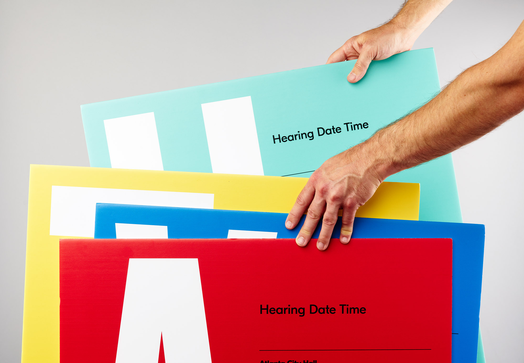
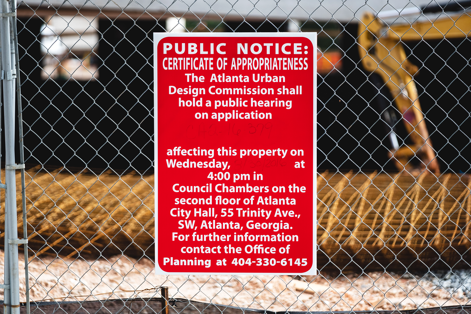
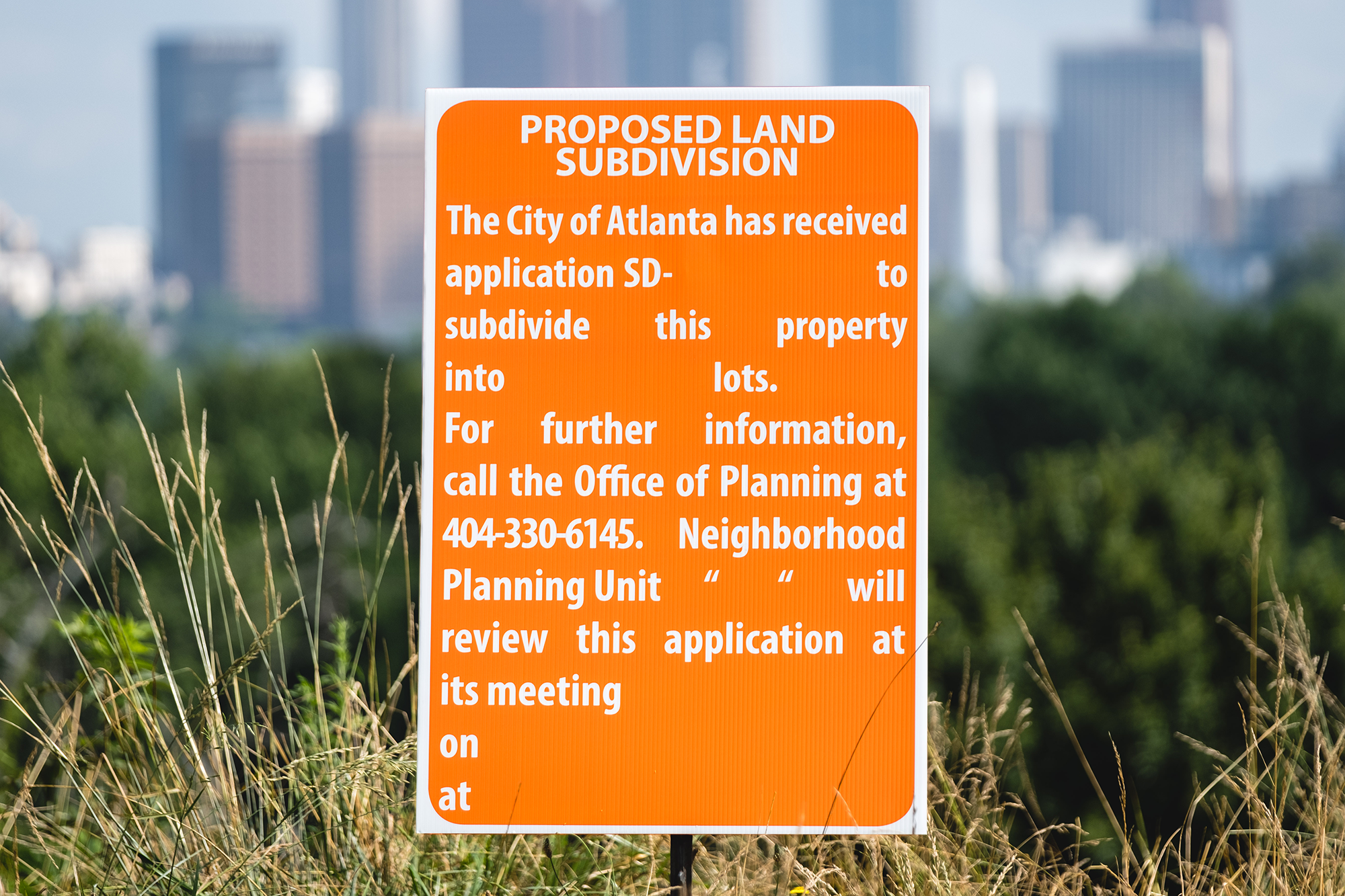
The Department of City Planning wanted to better engage the citizens of Atlanta with the expansive development happening around town with new Public Notice signs. Their old ones lacked clarity and were difficult read, ultimately undermining their importance. The goal was to improve their obscure visibility in hopes to drive community engagement and bring residents together with an inclusive and distinctly identifiable solution.
Featured on Fast Company's Design.Co and on Grilli Type
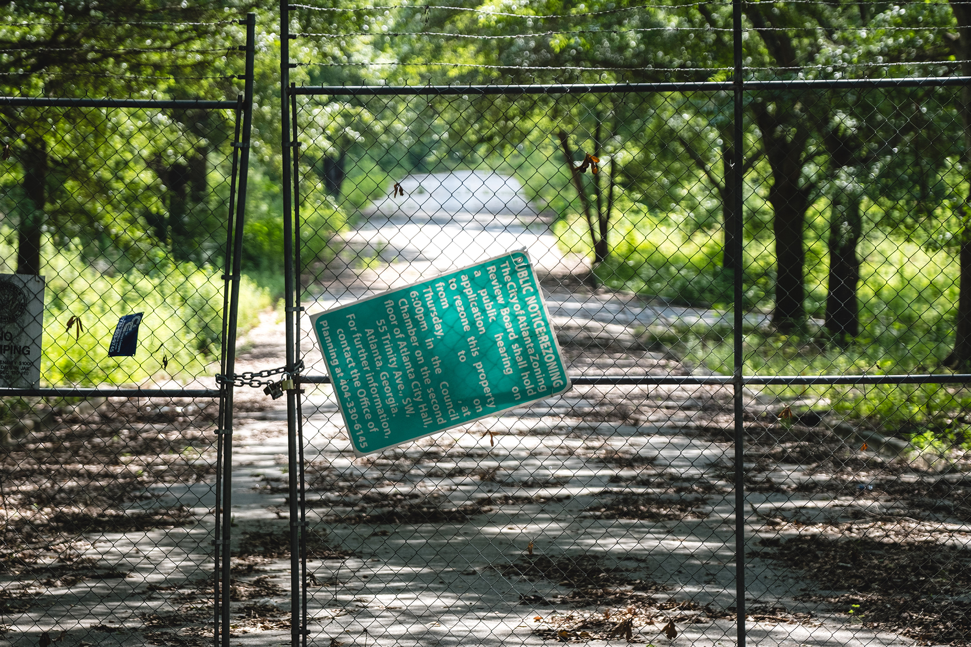
(Before)
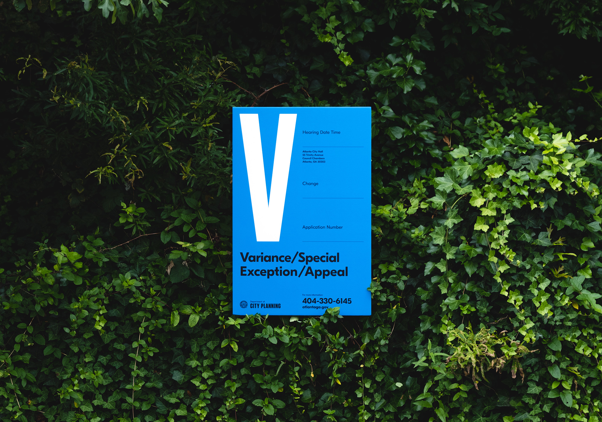
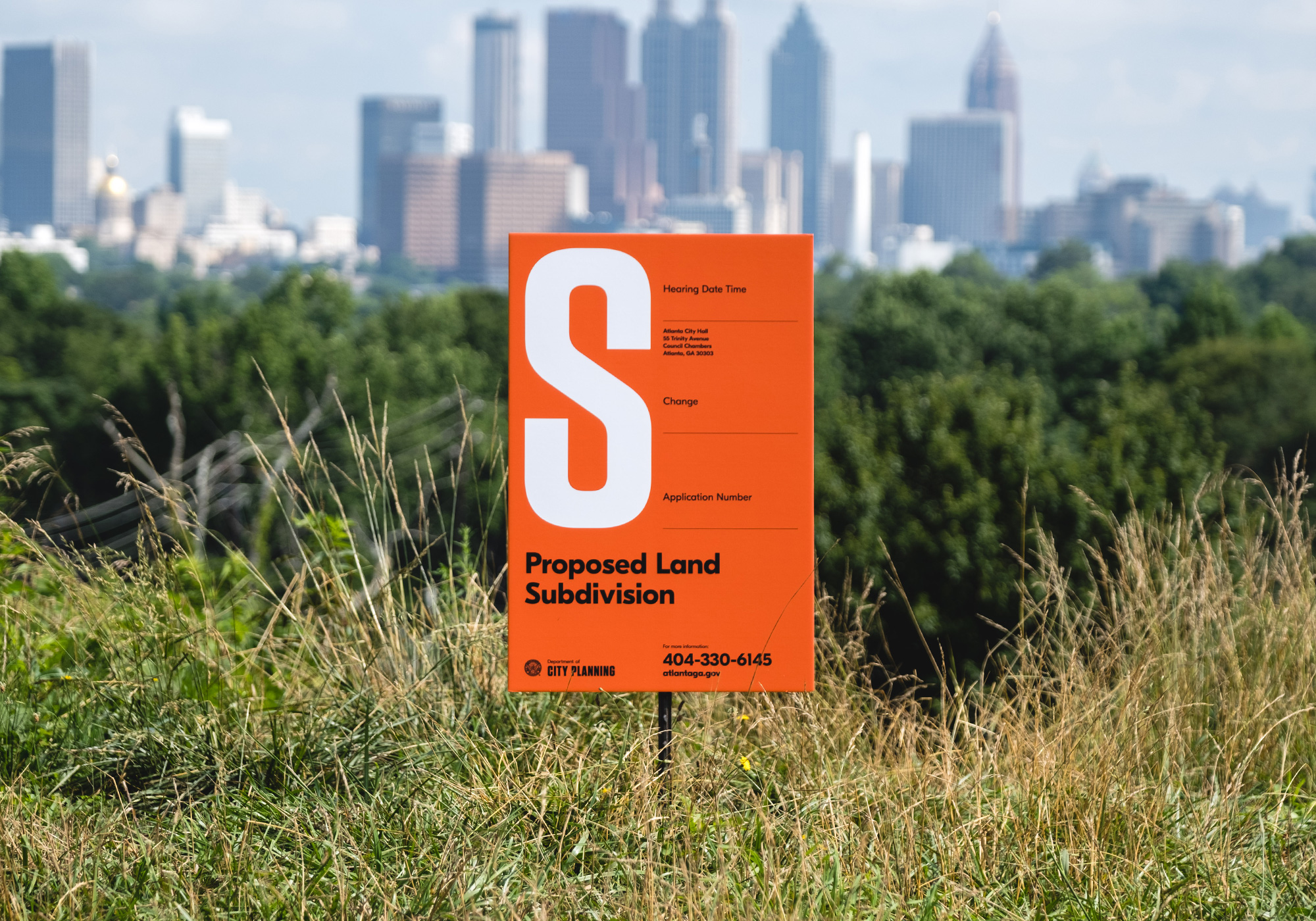
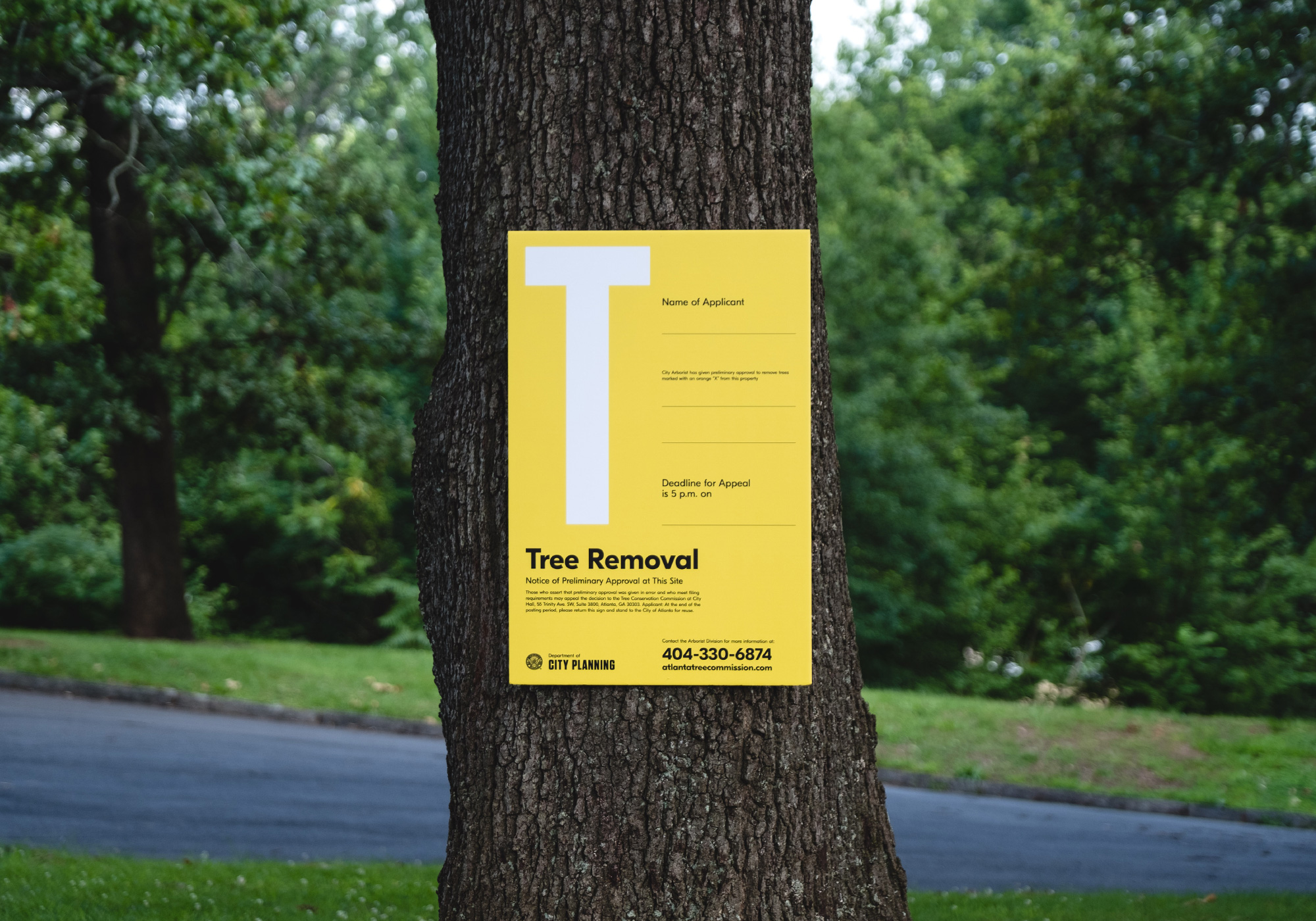
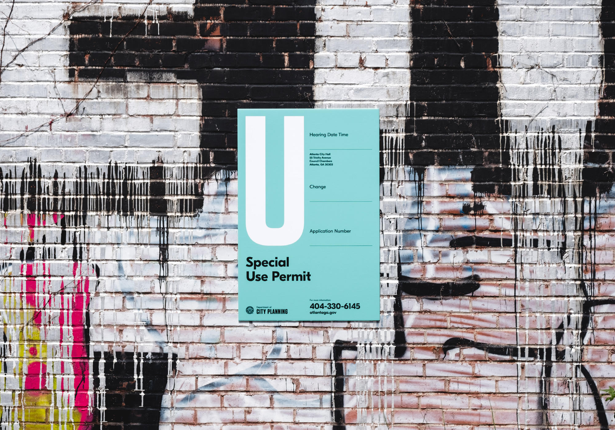
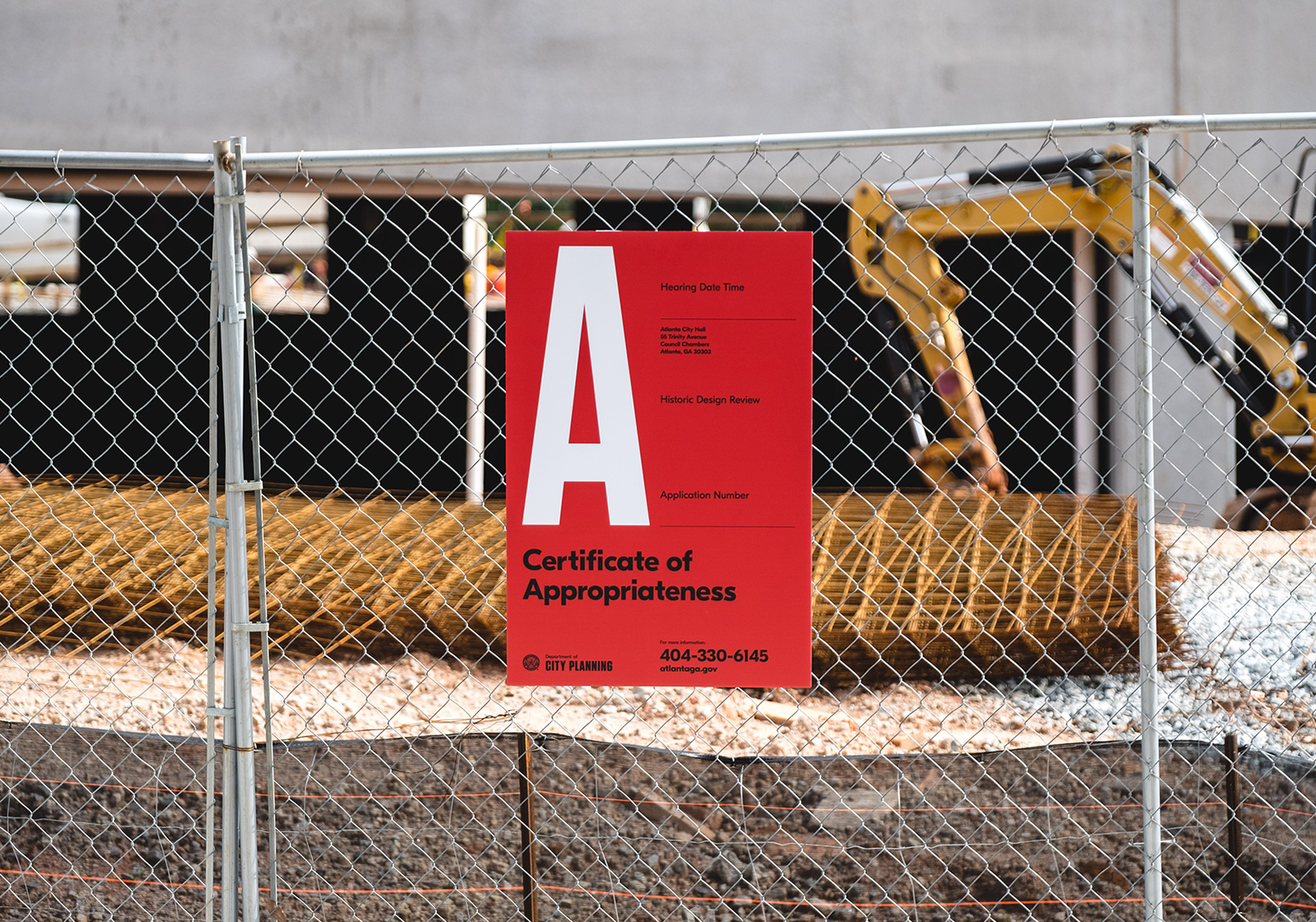
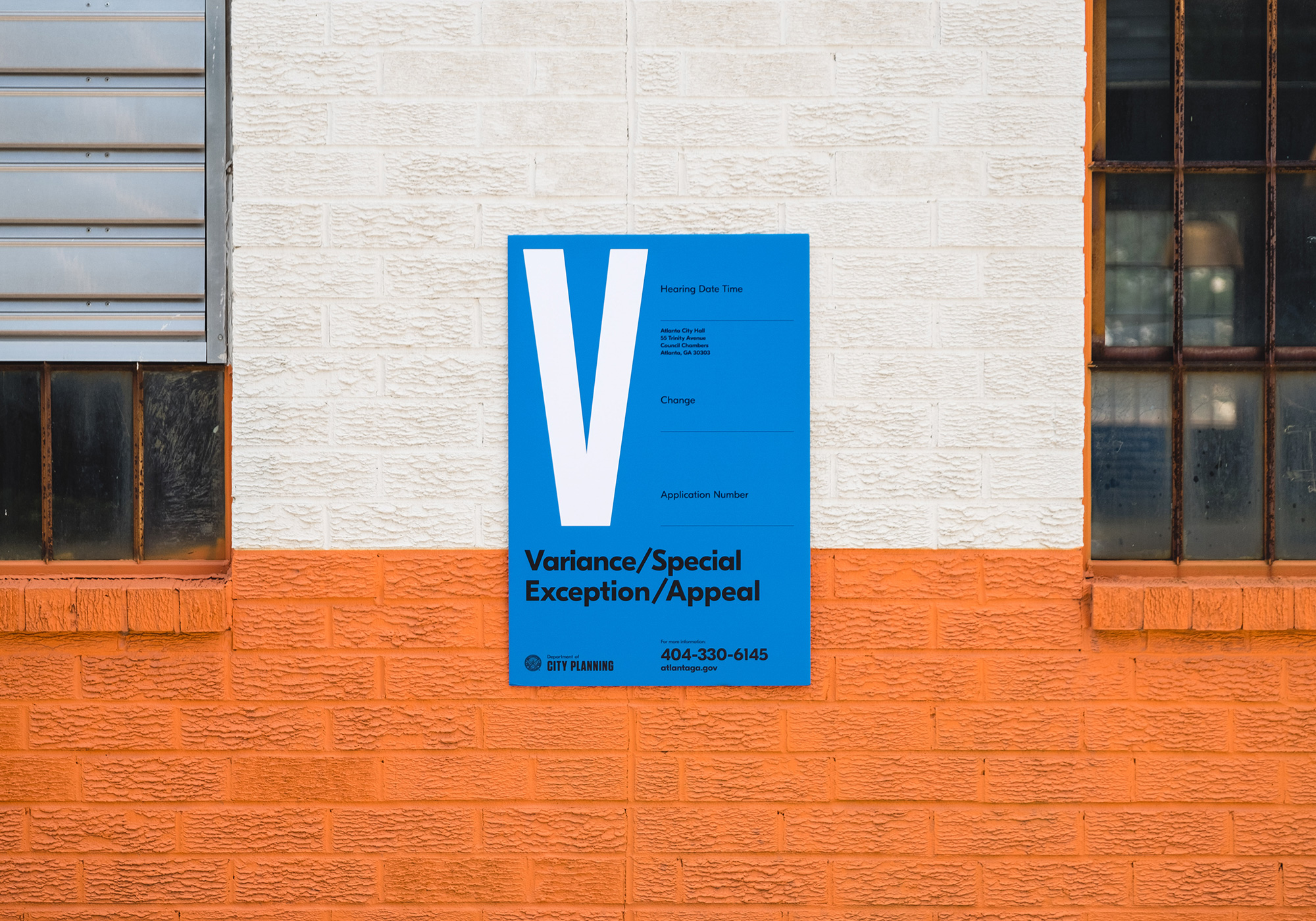
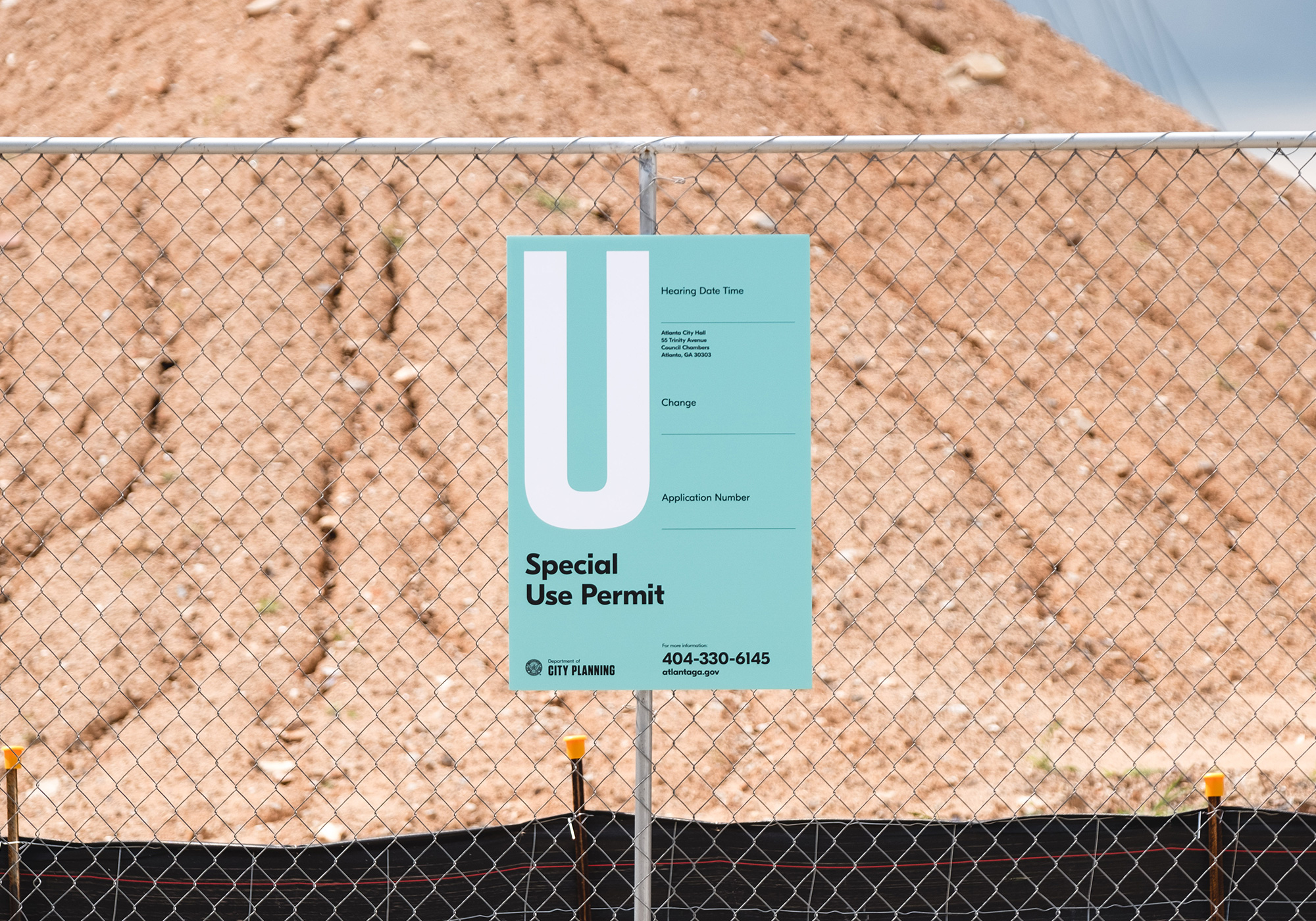

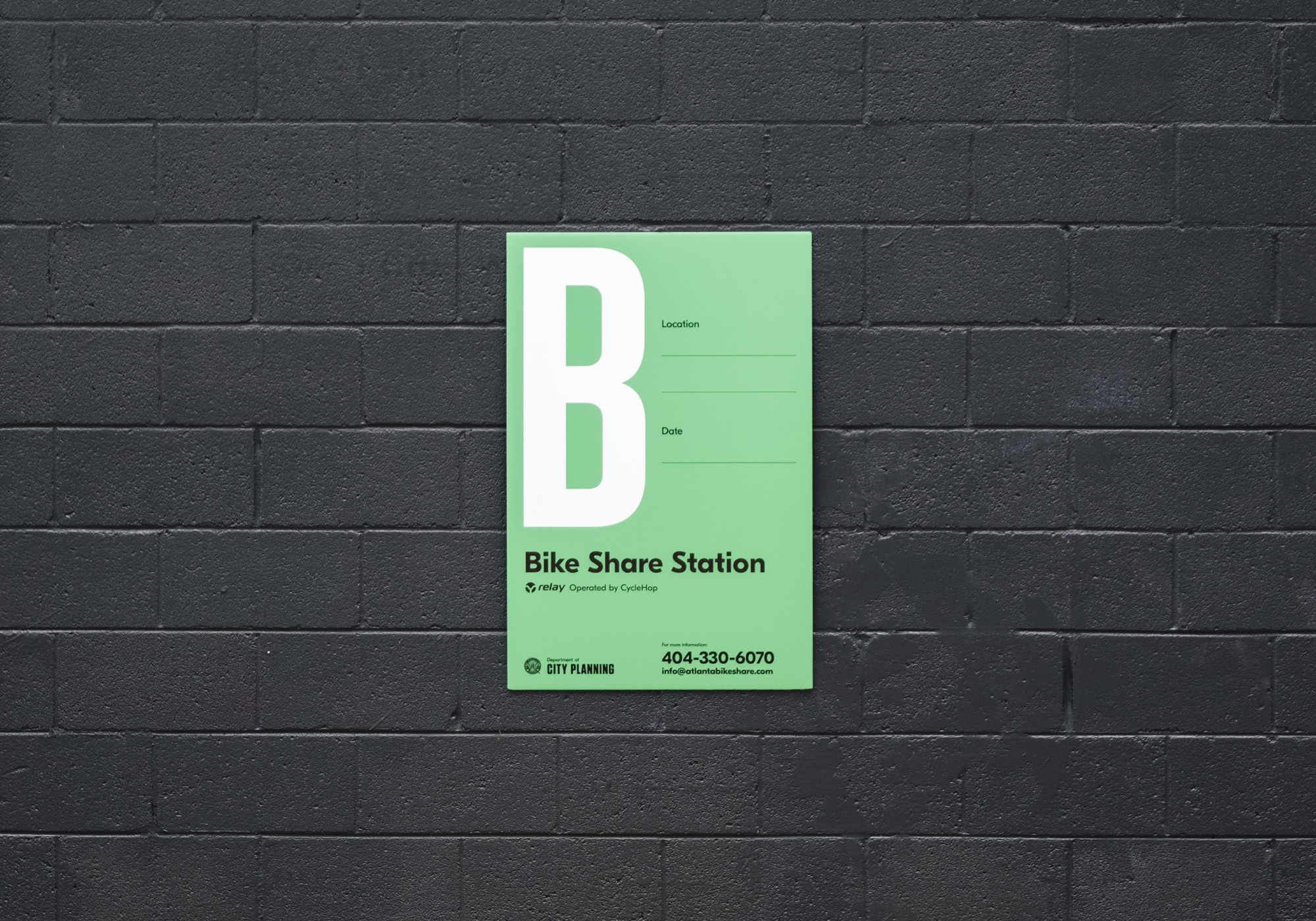
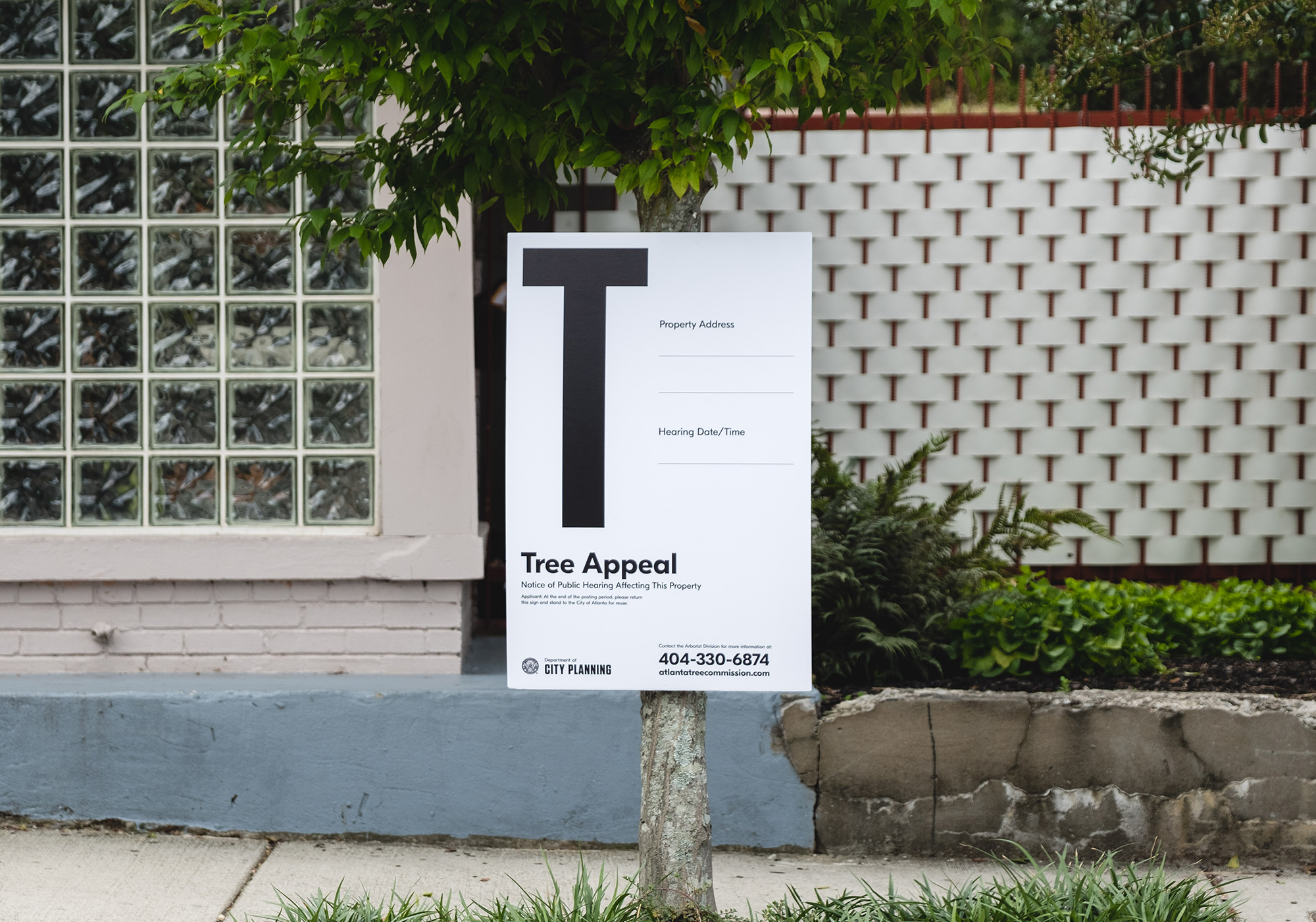
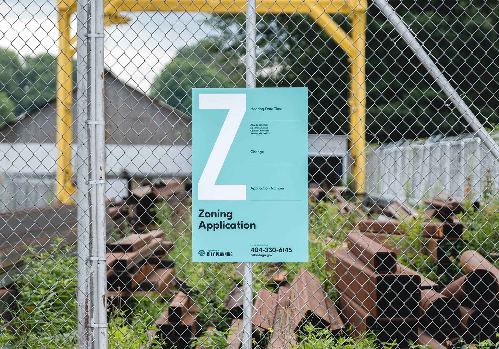
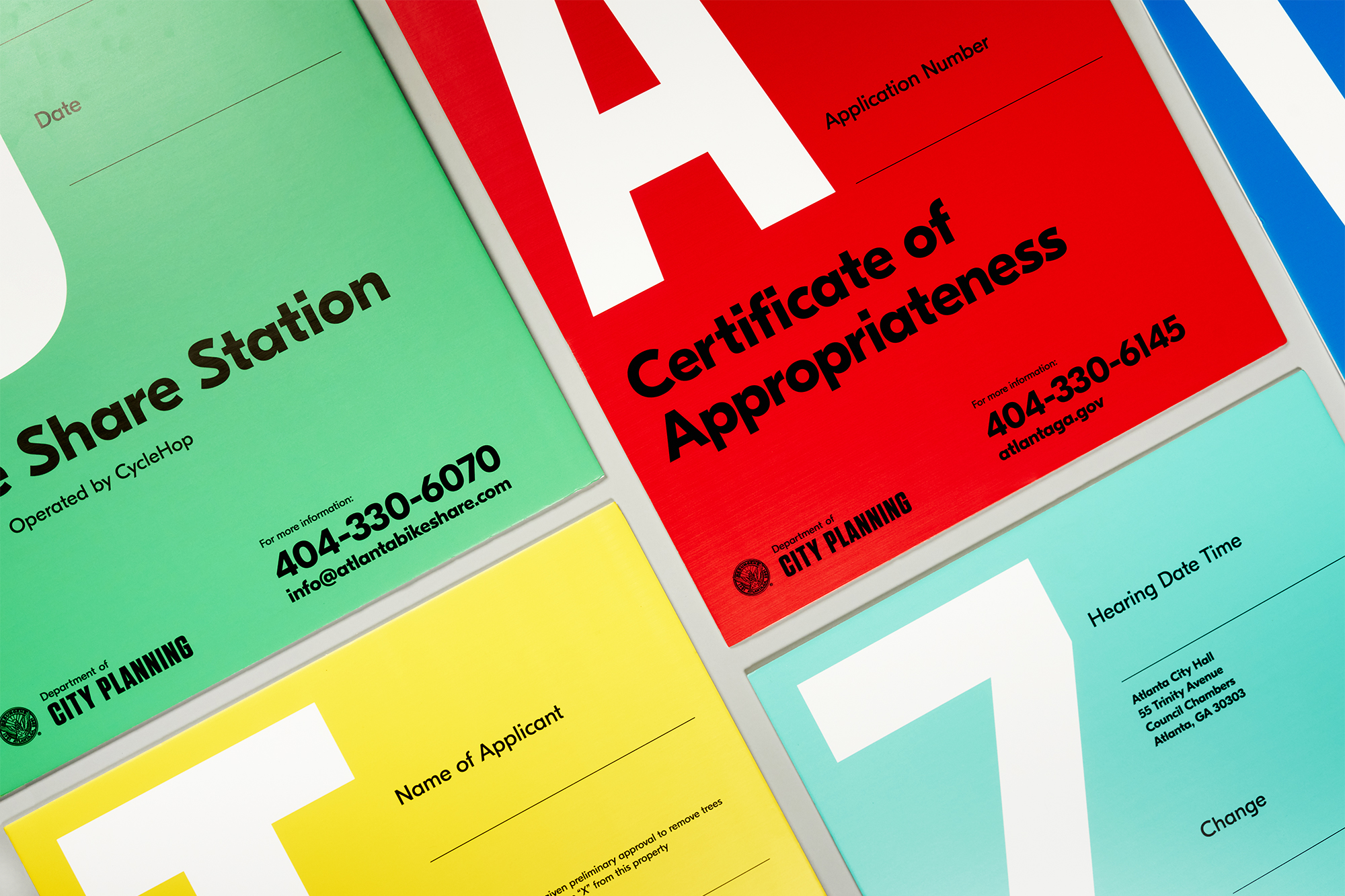
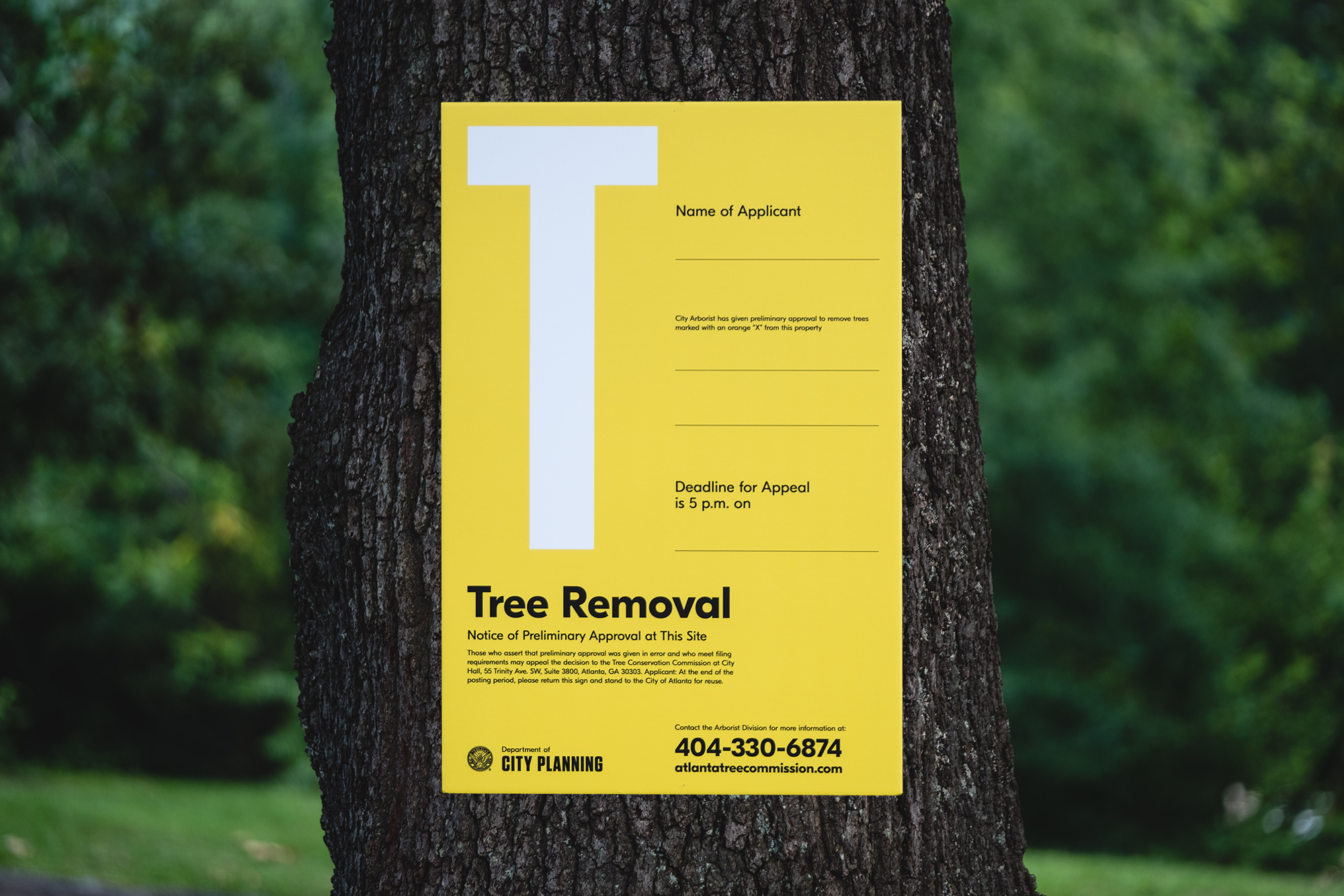
Working alongside Commissioner Tim Keane, a clear and sensible visual system was designed to create a look that was unexpectedly engaging yet flexible for various use-case scenarios. Visual hierarchy was used by consistently adhering to a grid and highlighting a single letter allowing for flexibility dependent upon it purpose. Colors were also refined to uniquely reflect a flourishing Atlanta and boldly frame each sign no matter its backdrop. The Department's new logo and brand typefaces were also incorporated to complete the look.
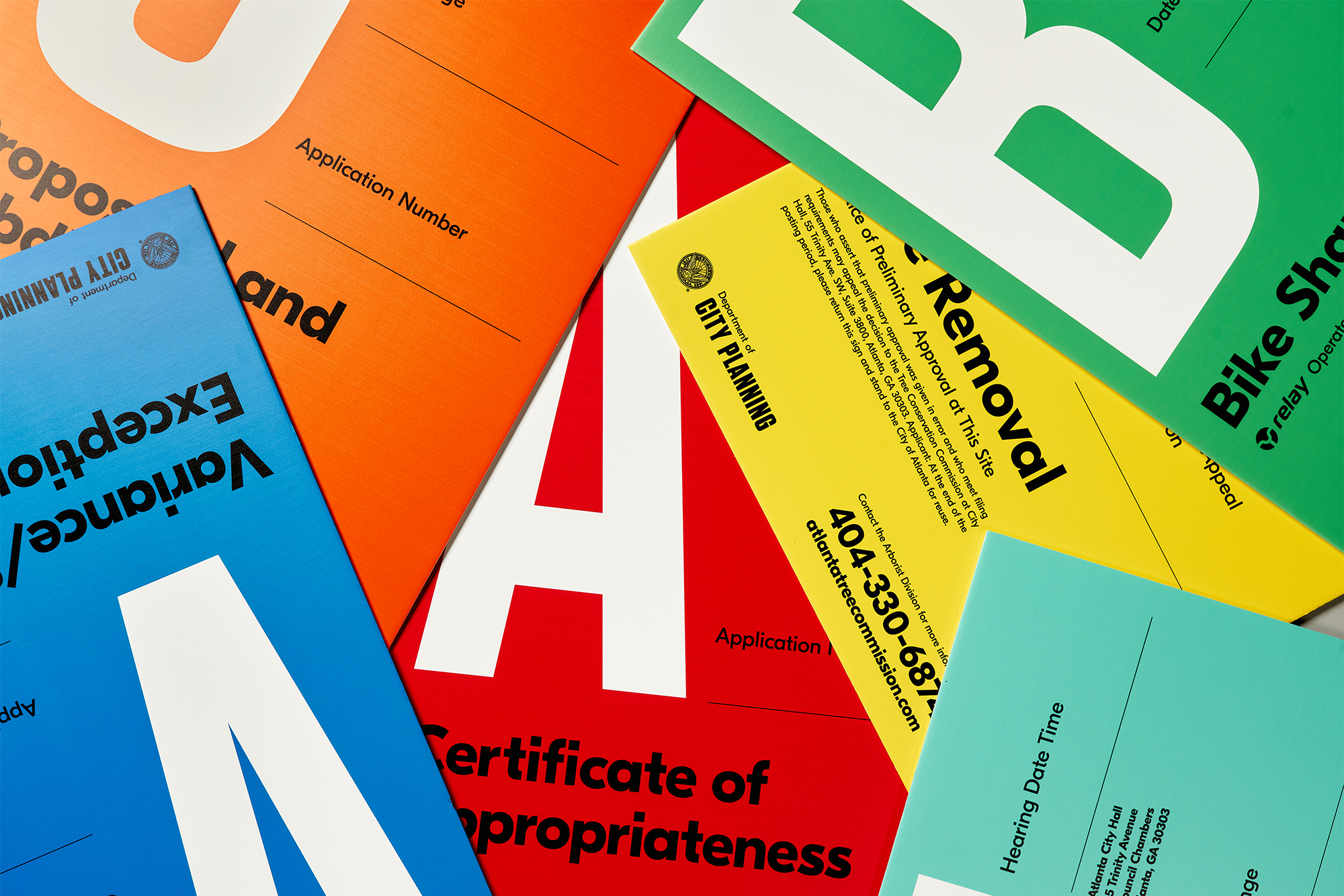
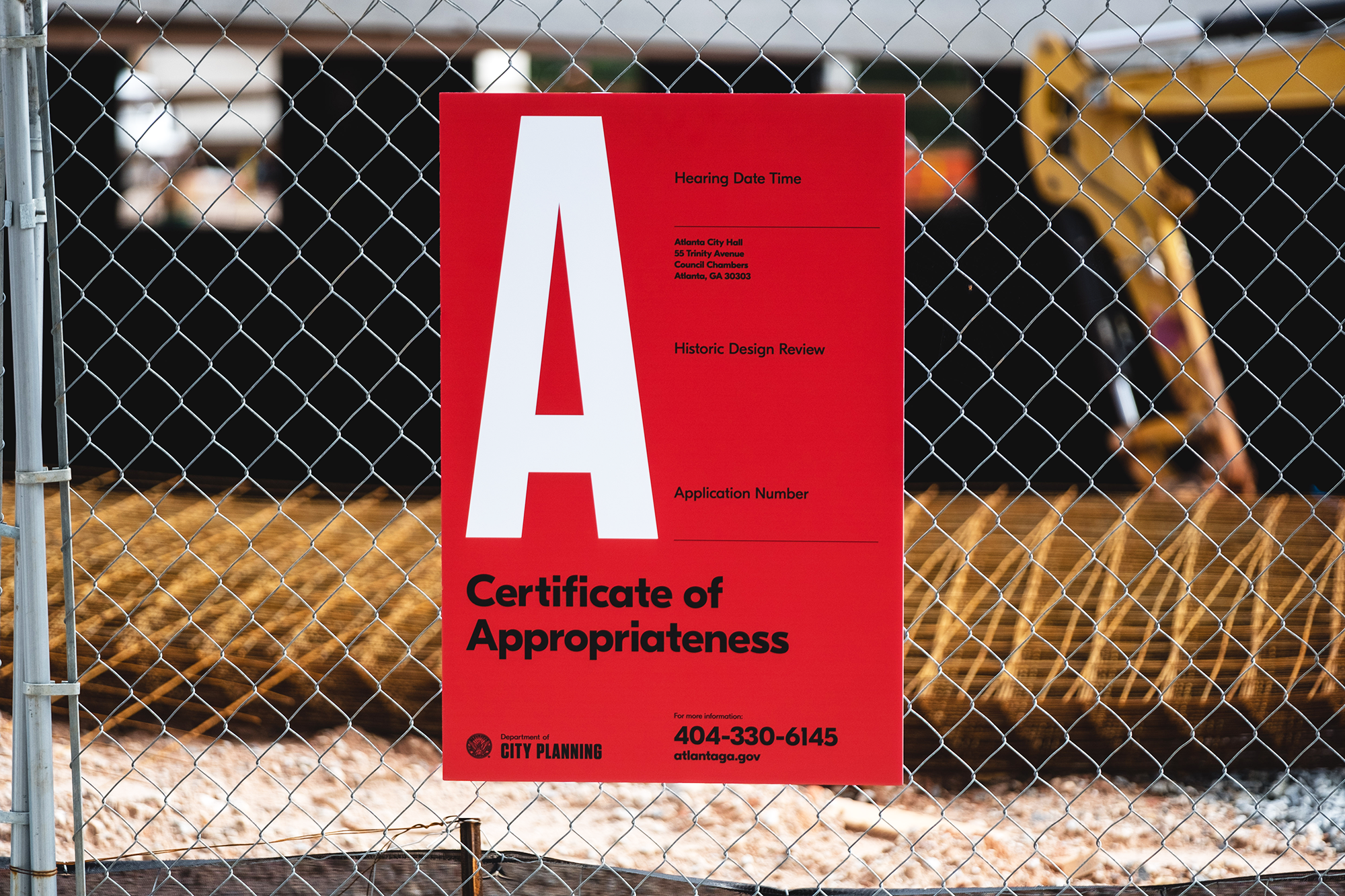

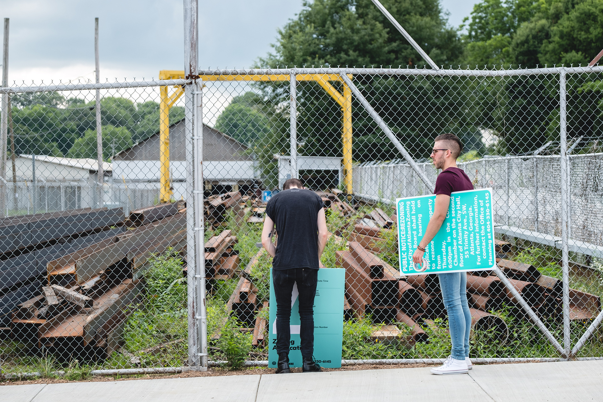
The new signs can be seen throughout the city, notifying residents of change in their community and helping bring clarity where there was once confusion or indifference. Seeing the welcoming responses thus far has been encouraging and further proves that thoughtful, responsible and intelligent design is what Atlanta and it's residents want as well as deserve.


Brian Paul Nelson, LLC in partnership with © Matchstic

© Forever x Infinity, Brian Paul Nelson, LLC
Thanks for being here. ︎
Thanks for being here. ︎