Bold Monk Brewing Co.

For the Glory of Beer
The Bold Monk Brewing Co. is a brewery, restaurant and beer garden located in Atlanta’s revitalized Upper Westside neighborhood. Inspired by traditional Belgian Trappist brewing, they produce a range of offerings with updated tastes for the mindful connoisseur and the curious soul alike.
With a courageous spirit, Bold Monk infuses these traditions with youthful wisdom and a modern sensibility. They asked for a steadfast brand strategy and an identity system that highlighted their fearless, new-age approach to old-world conventions.
Collaboration Included
—
Brand Strategy
Brand Identity
Can + Label Design
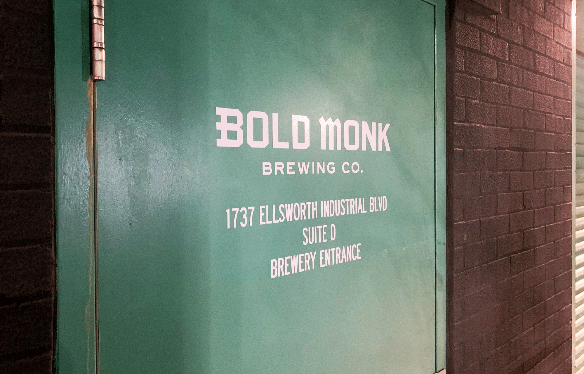
Environmental Signage
Illustration
Print Design + Materials
Swag Design


To visually represent the brewery, a strong yet approachble wordmark was designed with custom lettering inspired by Gothic blackletter scripts of the past.
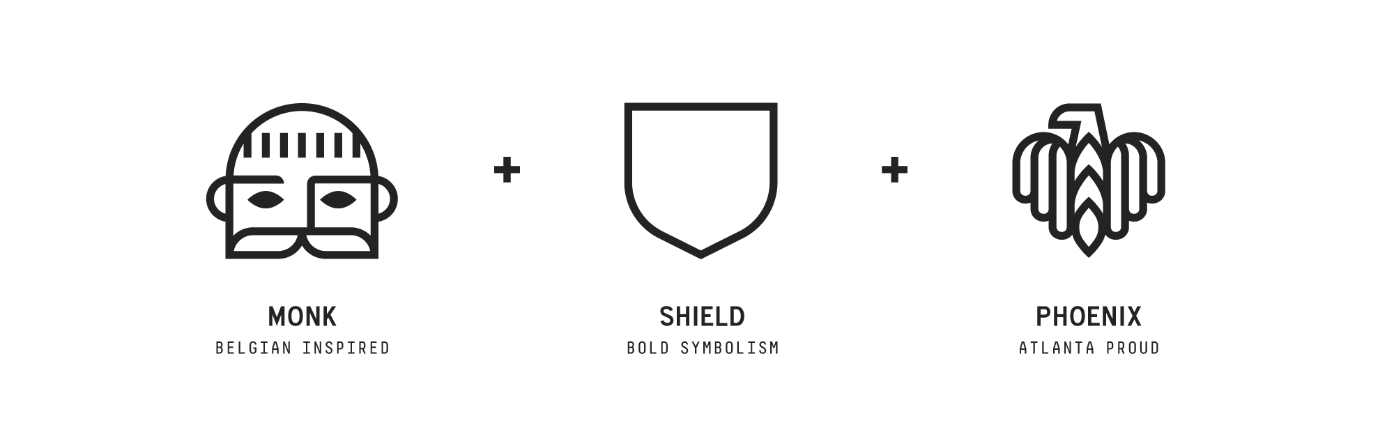
Their beloved symbol took shape by succinctly combining three powerful elements—the bold monk, a compelling shield, and a rising phoenix which was activated from Atlanta’s seal as a valiant indicator of a city that has redefined and reinvented itself time and again.
Bold Monk’s brandmark was purpose built for the physical brewery location and all internal and external touchpoints beyond their beer labels.

The brewery, rich in tactile wood and stone, is a place where people are encouraged to engage, celebrate, and reflect. Artful dining and gathering spaces, both indoor and out are purposely designed to promote harmony and a shared spirit of joy.


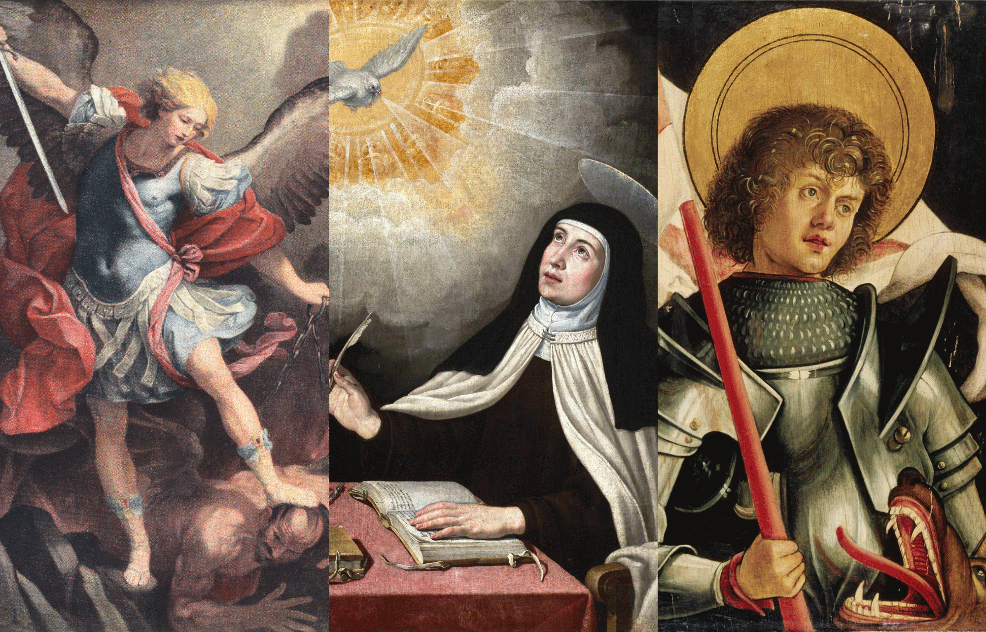
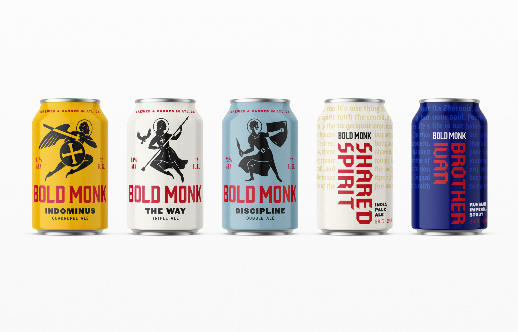
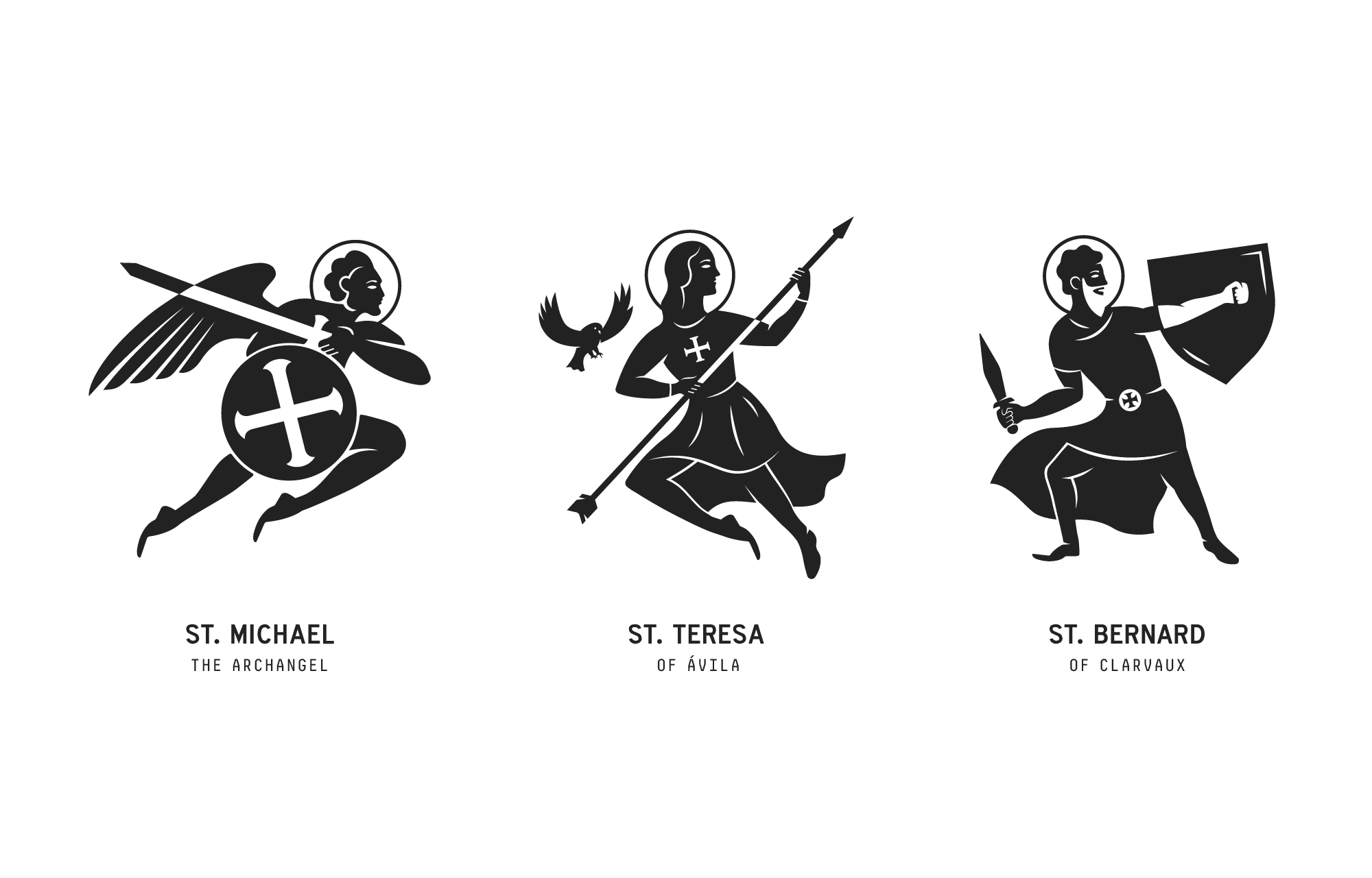
With a name like Bold Monk, it just felt right to illustrate well known monks, nuns and saints who have donned a warrior spirit. Inspired by relief paintings in ancient monasteries, these custom illustrations were created with a level of simplicity to exude a youthful, timeless approach. Each trappist-inspired beer is given it’s own warrior illustration along with a backstory that unveils their bold initiatives.


After the success of their original offerings, Bold Monk released two new summer ales. To reflect the lighter, brighter notes that accompany the season—and the beer— custom illustrations were drawn with tropical scenes to denote a playful atmosphere.

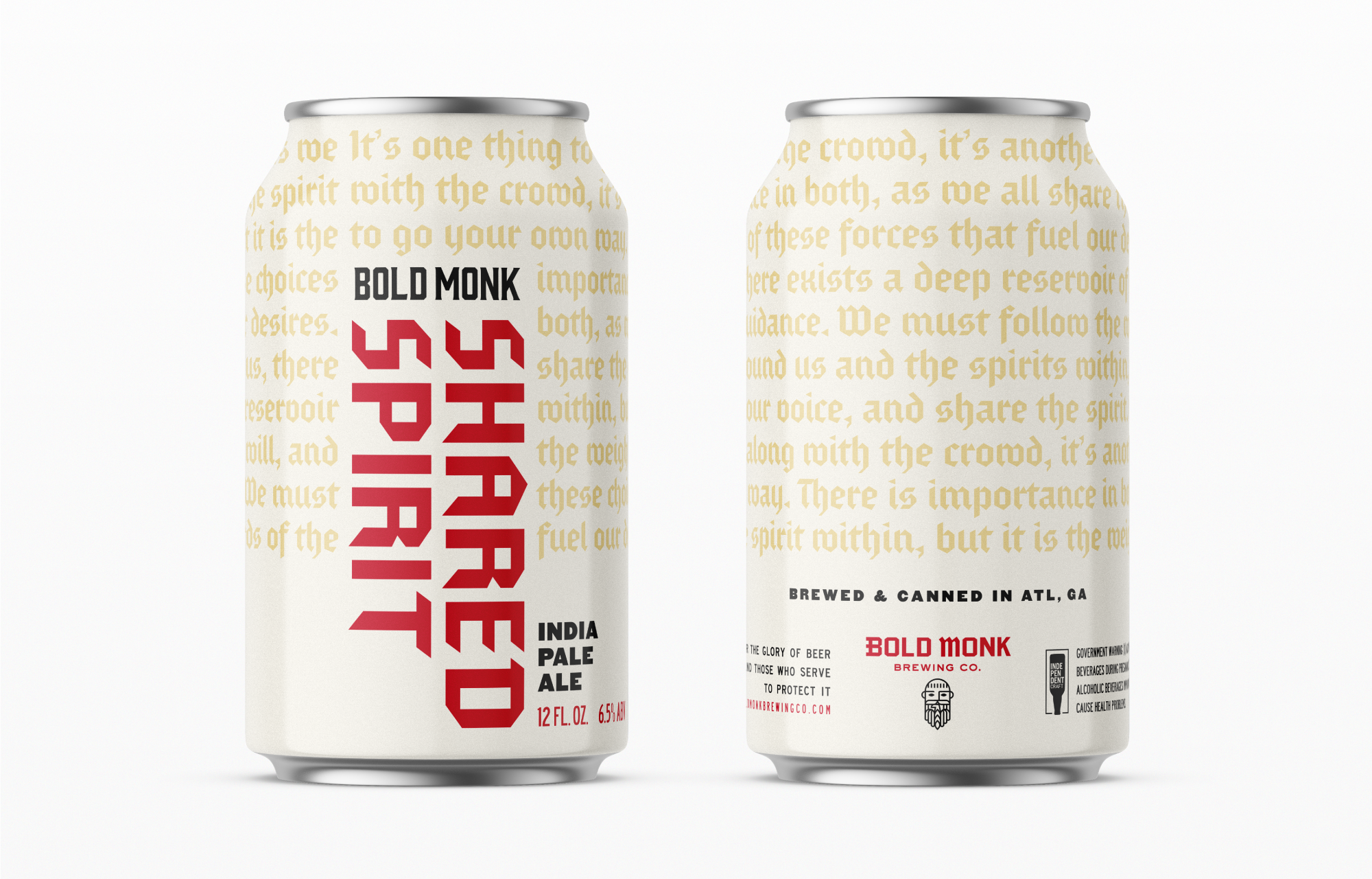
To appeal to their audience’s diverse palate, Bold Monk also brews non-trappist style beers. A secondary design collection was created to distinguish these distinct profiles.
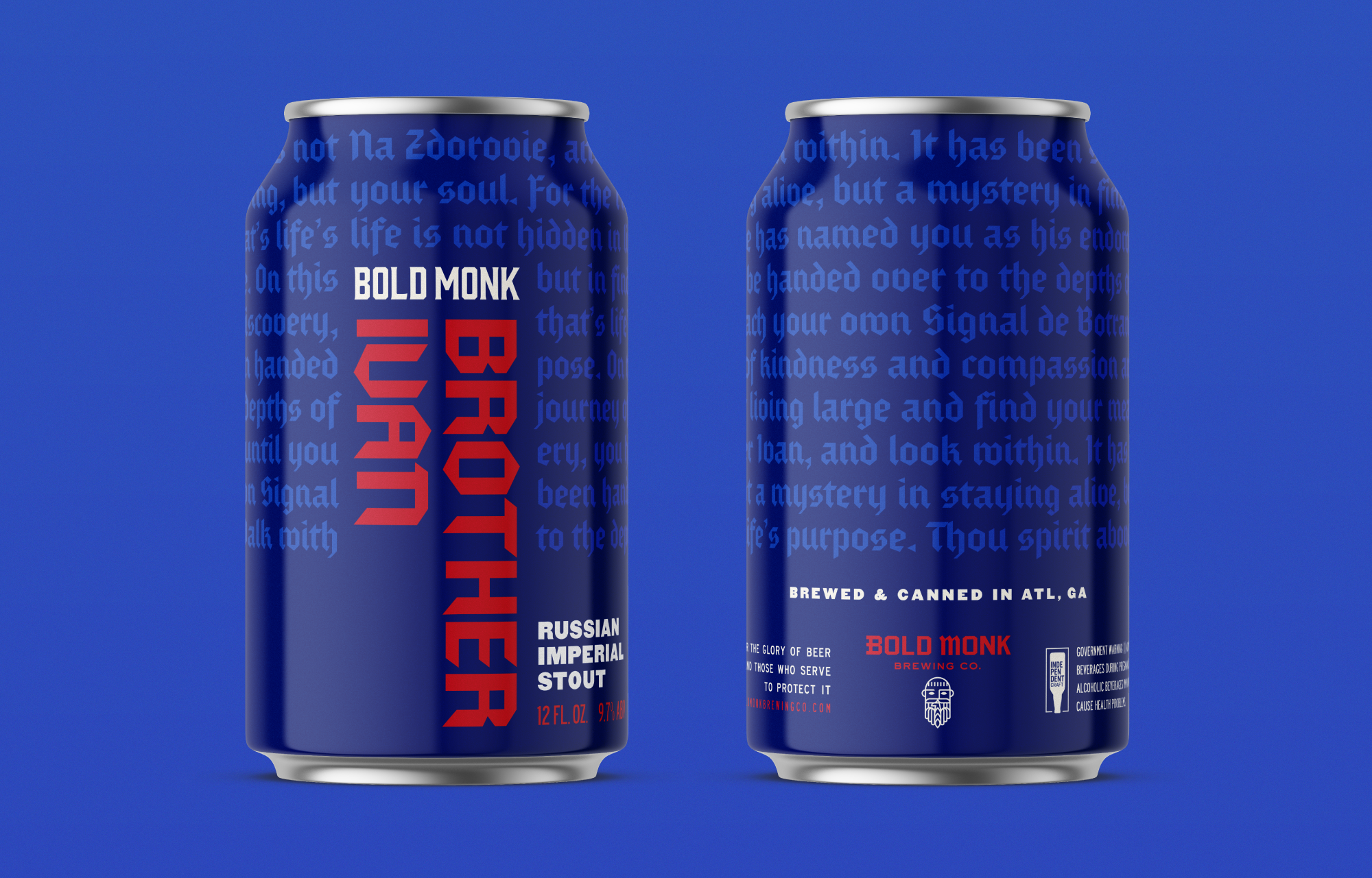

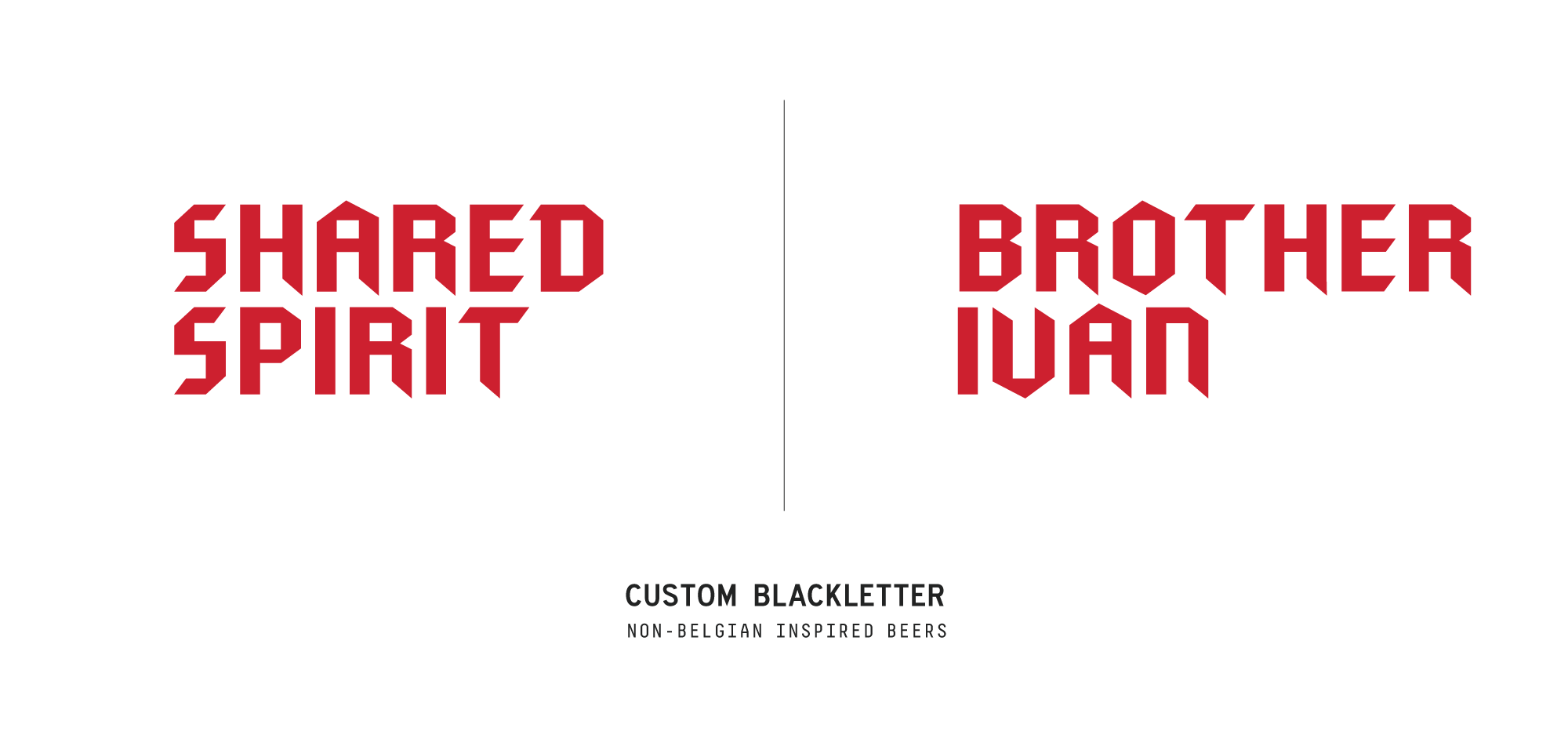
Keeping to the classically modern and simple directive, a custom blackletter alphabet was created to narrate self-inspired stories to wrap around each can. This design element was influenced by the unraveling of ancient scrolls that reveal its engaging text.
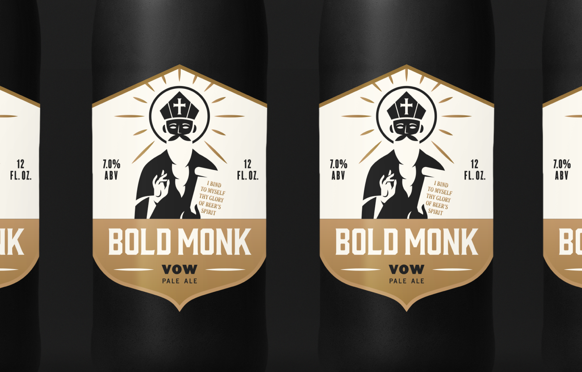
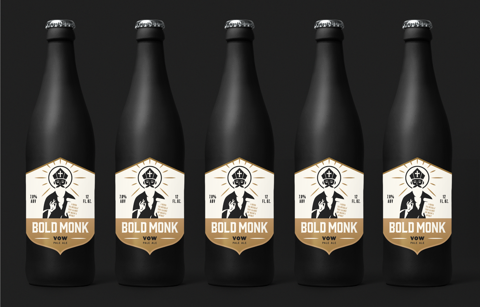
Occassionaly, Bold Monk features beers that run on a reserved scale. To highlight the lore of these offerings, a matte black bottle was designed along with a gold, foil-stamped label. A monk with a spiritual stature was illustrated for Vow, the pale ale offering. He is not without his bold intentions however, as his tablet states ‘I Bind to Myself thy Glory of Beer’s Spirit’.
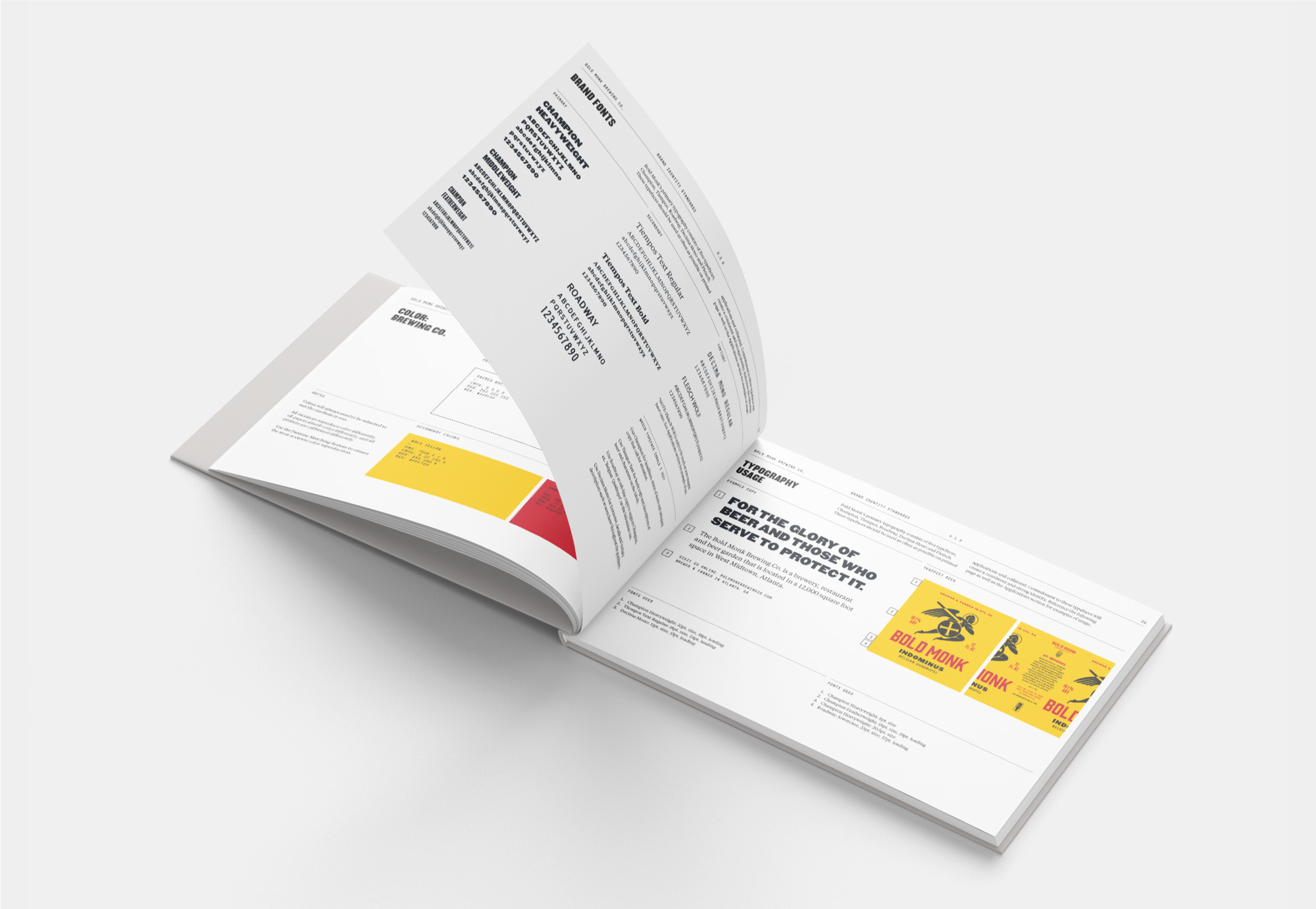
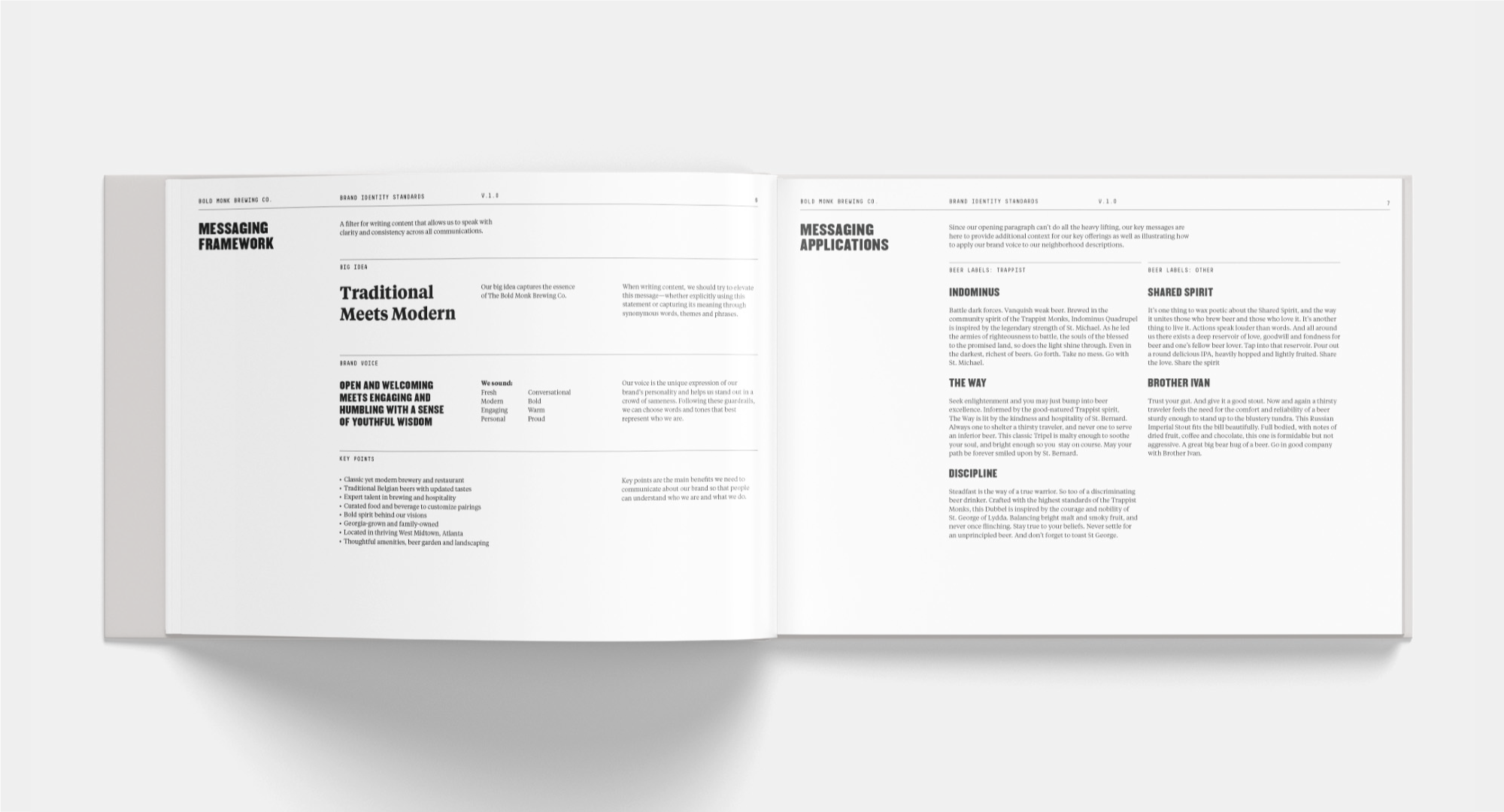
To capstone the visual identity, a thorough brand guidelines was developed to ensure consistency across all touchpoints. These guidelines outline and set directives for Bold Monk’s assets and their use as the company continues to grow.


© Brian Paul Nelson, LLC

© Forever x Infinity, Brian Paul Nelson, LLC
Thanks for being here.
Thanks for being here.