Human Rights First
Taking Critical Action
As one of many human rights organizations, Human Rights First decided it was time to solidify its identity and position in the NGO landscape.
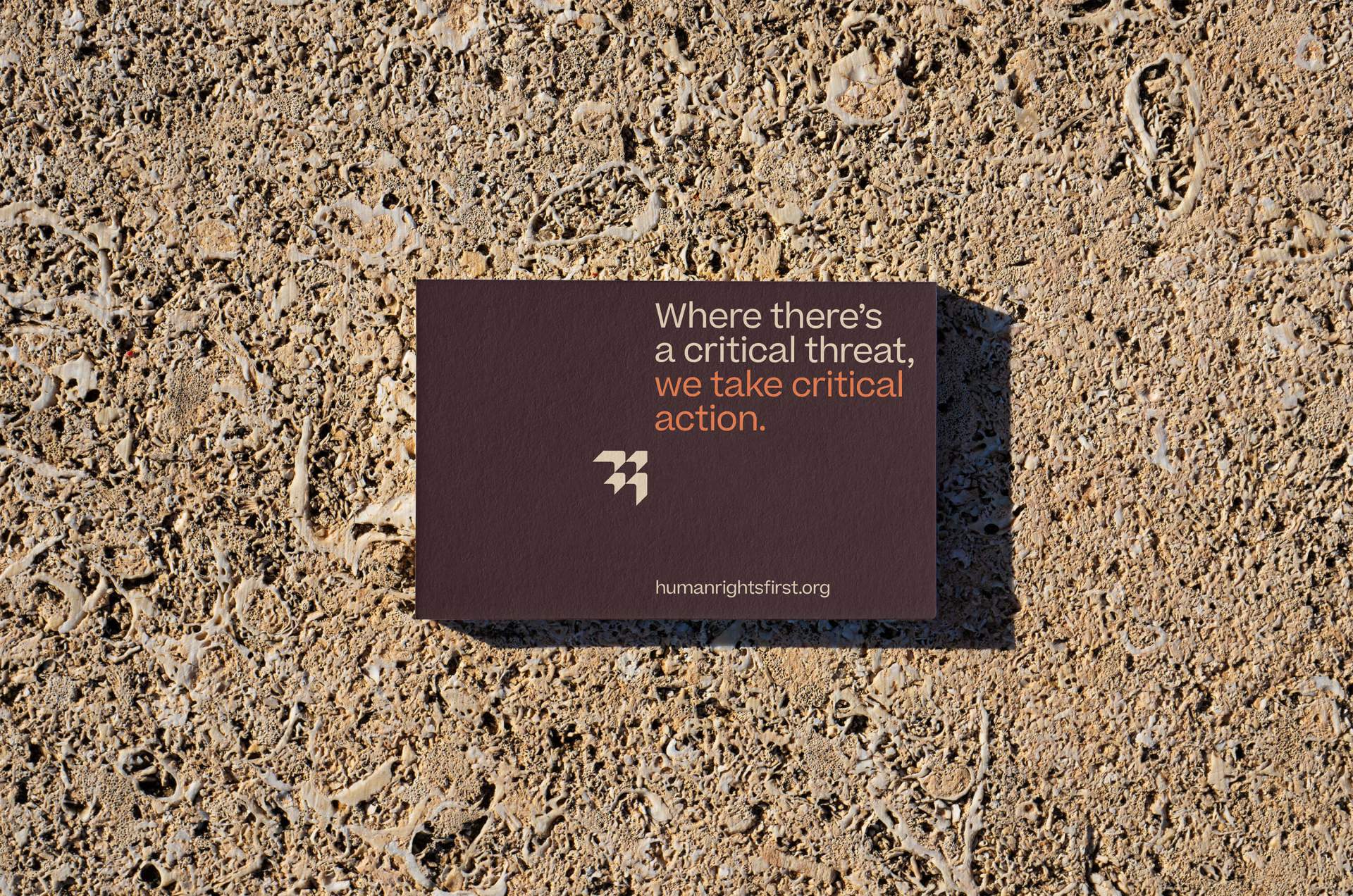
While other organizations raise awareness, rally grassroots supporters, or create complex programs, Human Rights First takes critical action by equipping and activating skilled experts to fight injustice around the world.
With this new truth in hand, they needed an expression that would not blend in with similarly named groups.
The new brandmark better reflects an active network that's leading the organization forward. Progress-driving arrows evoke their consistent effort toward boundless freedom.
Before
After
The brand voice and messaging toolkit further aids their team in succinctly and poignantly articulating who they are and what they do, without getting too granular or complex.

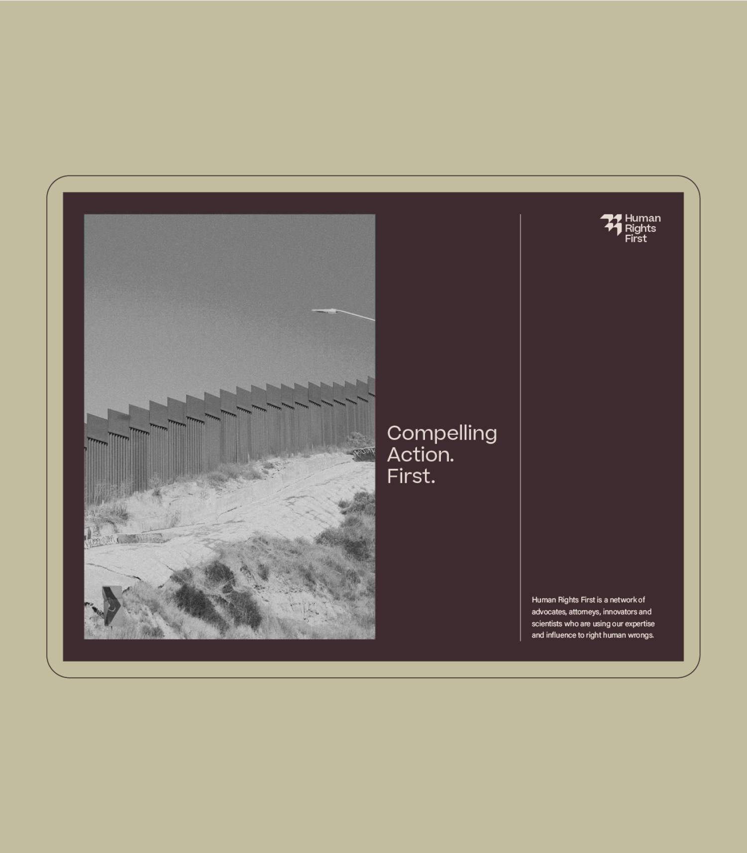
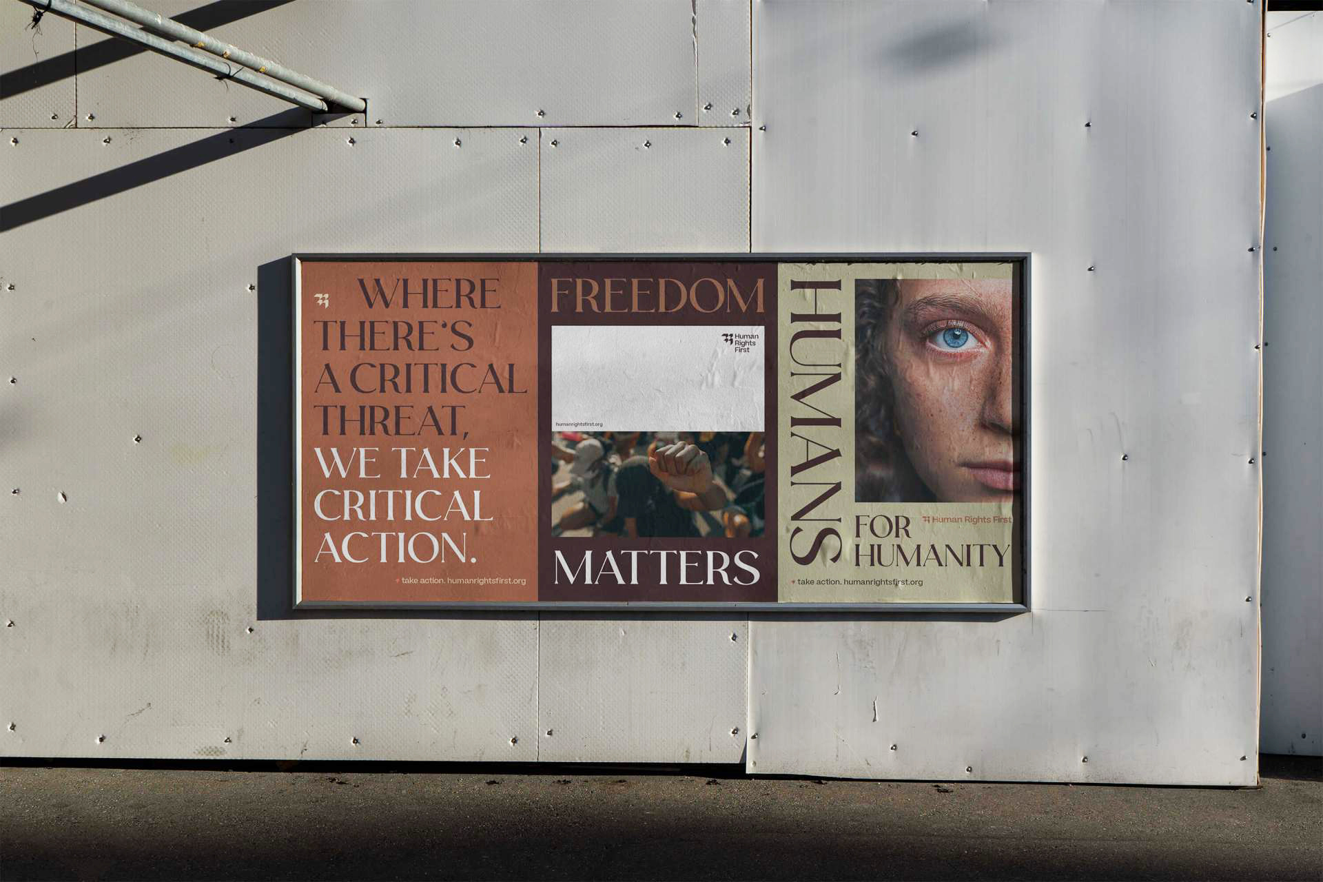
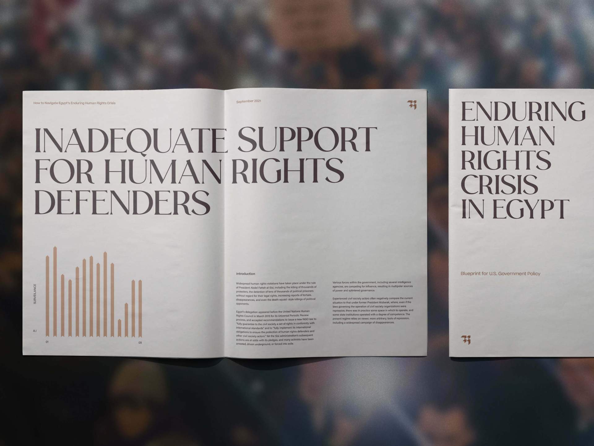
Bold messages pair with raw, emotional photography to bring a serious, yet hopeful tone to their communications. Sophisticated typography underscores the elite and seasoned nature of the organization.
Not simply known for one brand color, Human Rights First is more subtle, nuanced, and inclusive, with many shades and perspectives, like those they fight for. Hues range from neutral, and understated to an active orange from the previous identity.
Brian Paul Nelson, LLC in collaboration with © Matchstic
Case study copy & imagery courtesy of Matchstic

© Forever x Infinity, Brian Paul Nelson, LLC
Thanks for being here. ︎
Thanks for being here. ︎