The Breman
Stories Get Lost Without Keepers
The Breman is an Atlanta institution that houses the Southeast’s largest collection of Jewish archives. A storied place where people from all backgrounds can come together to engage in dialogue, get steeped in history and experience the arts. The only problem was that nobody knew about it.
It wasn’t that they weren’t delivering on great experiences, it was that most Atlantans, outside of the Jewish community, had never heard of this place. It became clear that “museum” was holding them back and they needed to reposition themselves as a cultural center offering much more than just world-class Holocaust education and exhibits. We took the opportunity to go all in on a brand strategy built around world-class immersive experiences that welcome all who are culturally curious to spark their story-seeking.
Collaboration Included
—
Brand Strategy
Brand Identity
Brand Messaging
Environmental Signage
Presentation Design
Print Design + Materials
Social Media Templates
Stationery Suite
Swag Design
Wayfinding Design
Website Design

Like any unique cultural center, we pushed them to embrace their true identity and not hold back with a show of southern-meets-Jewish hospitality and personality.
Visually, we started by developing an elegant wordmark that feels both storied and modern, living up to the Breman’s timeless yet innovative spirit.
Visually, we started by developing an elegant wordmark that feels both storied and modern, living up to the Breman’s timeless yet innovative spirit.


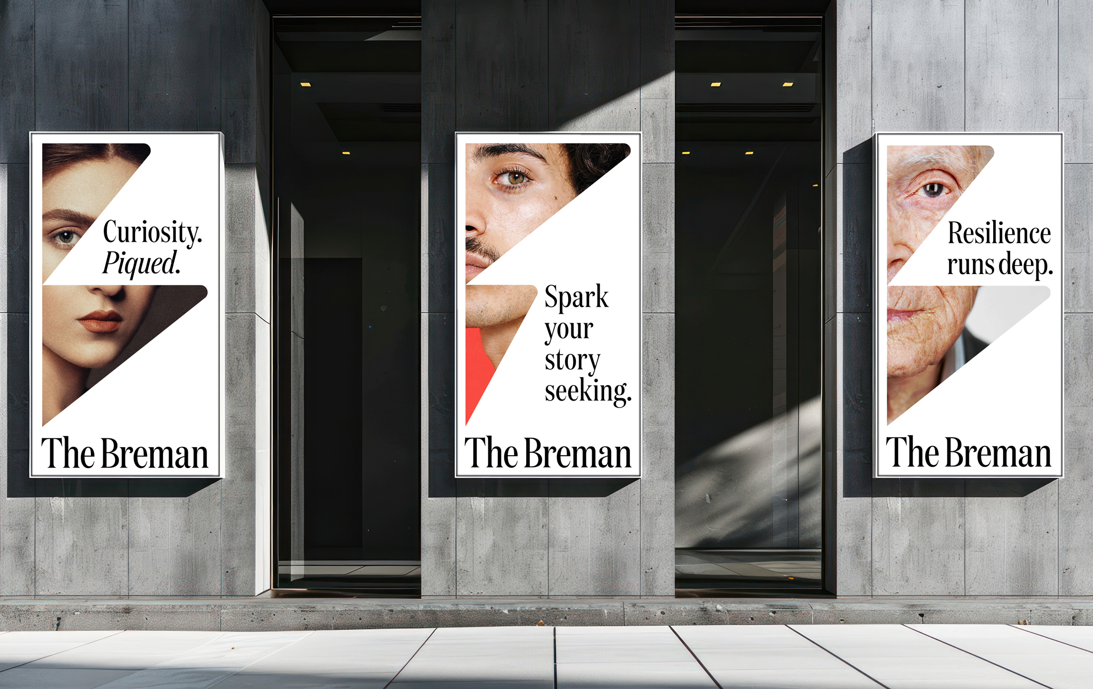
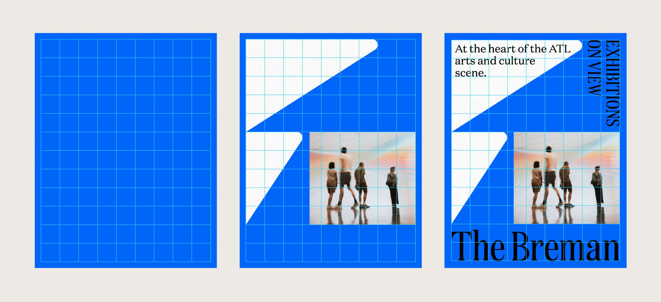
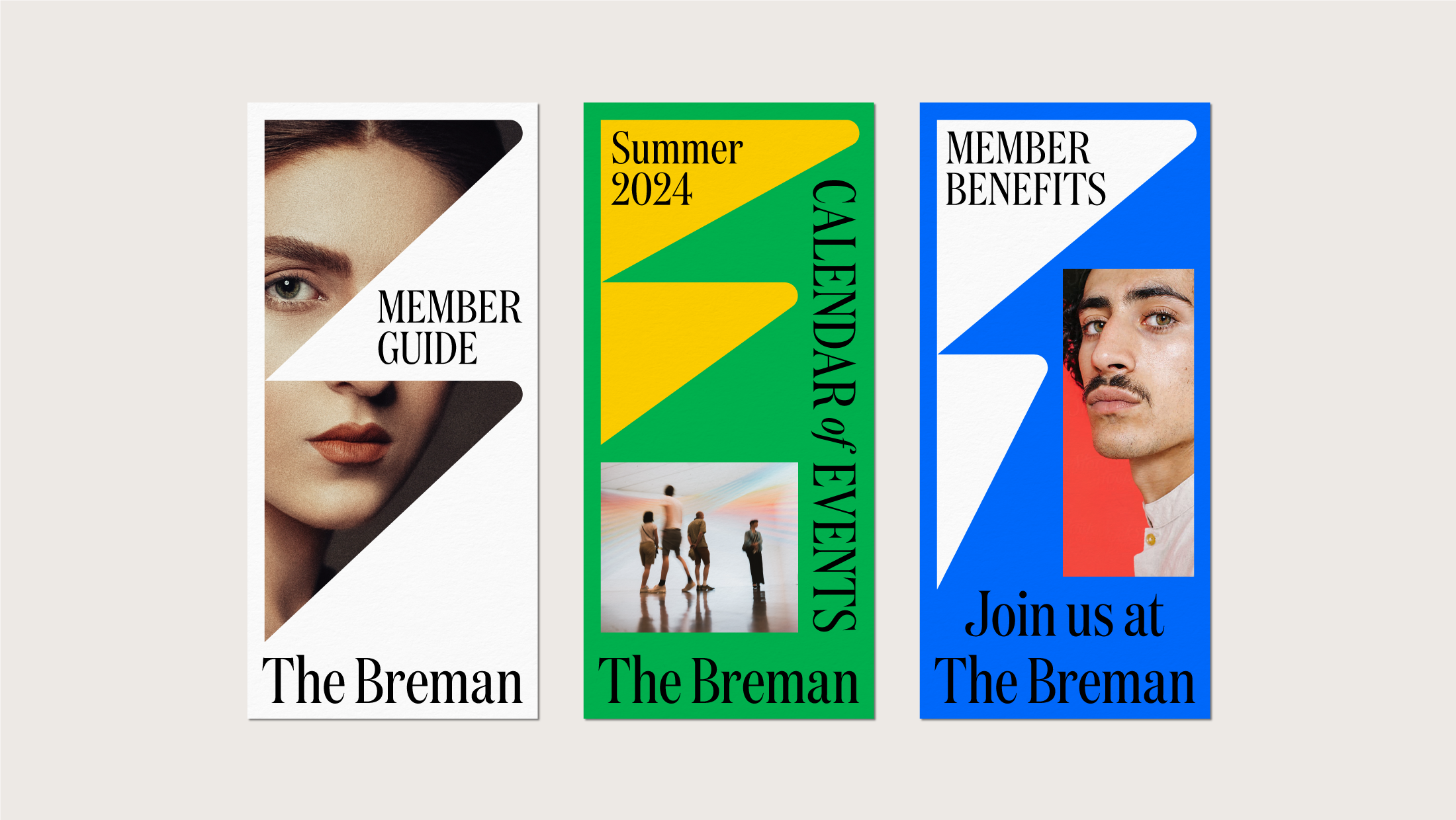
The ‘Dynamic B’ was then designed to be The Breman’s instantly recognizble symbol— representitive of the cultural stories they champion. Flexible in its use, the symbol pushes and pulls in interesting ways to provide a modern frame for captivating words and captivating photography.
A simple grid system was introduced to create effective layouts with the ‘Dynamic B’ and how it interacts with photography and typography.


A brand voice was developed through the archetype Magnetic Storytellers to captivate and engage The Breman’s audience. The brand’s messaging invites people in and welcomes them to stay by sharing collected stories of all kinds that educate, inspire, and illuminate through history, arts, cultural experiences, and conversations.

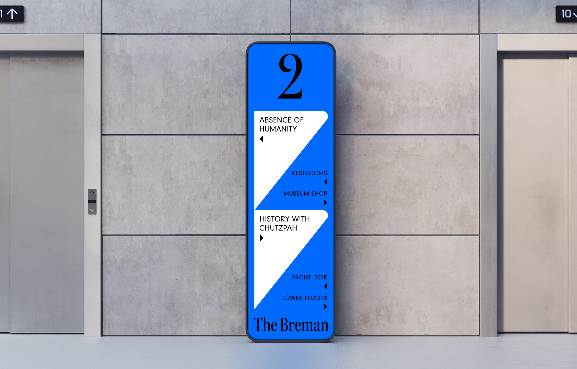
With the renovation of their space, we also created a wayfinding system built around clarity and simplicity. The ‘Dynamic B’ was used graphically to add sharp emphasis and energy.


The brand’s visual identity was overhauled to create a unified system comprising of core assets—a dynamic symbol, an elegant wordmark, a diverse and imaginative color palette, typography with a conversational tone, magnetic photography, and dynamic graphic devices. This wide range of tools was designed to be played up or down across all applications.


Ultimatley, The Breman’s new identity captures their heritage and builds on their past with a modern look and feel that speaks to people of all ages, cultures and backgrounds. They now feel at home amongst Atlanta’s most recognizable cultural centers—yet stand apart with an expression of great story-keepers who share experiences of life through a Jewish lens.
© Brian Paul Nelson, LLC in partnership with © Matchstic

© Forever x Infinity, Brian Paul Nelson, LLC
Thanks for being here.
Thanks for being here.