Totem
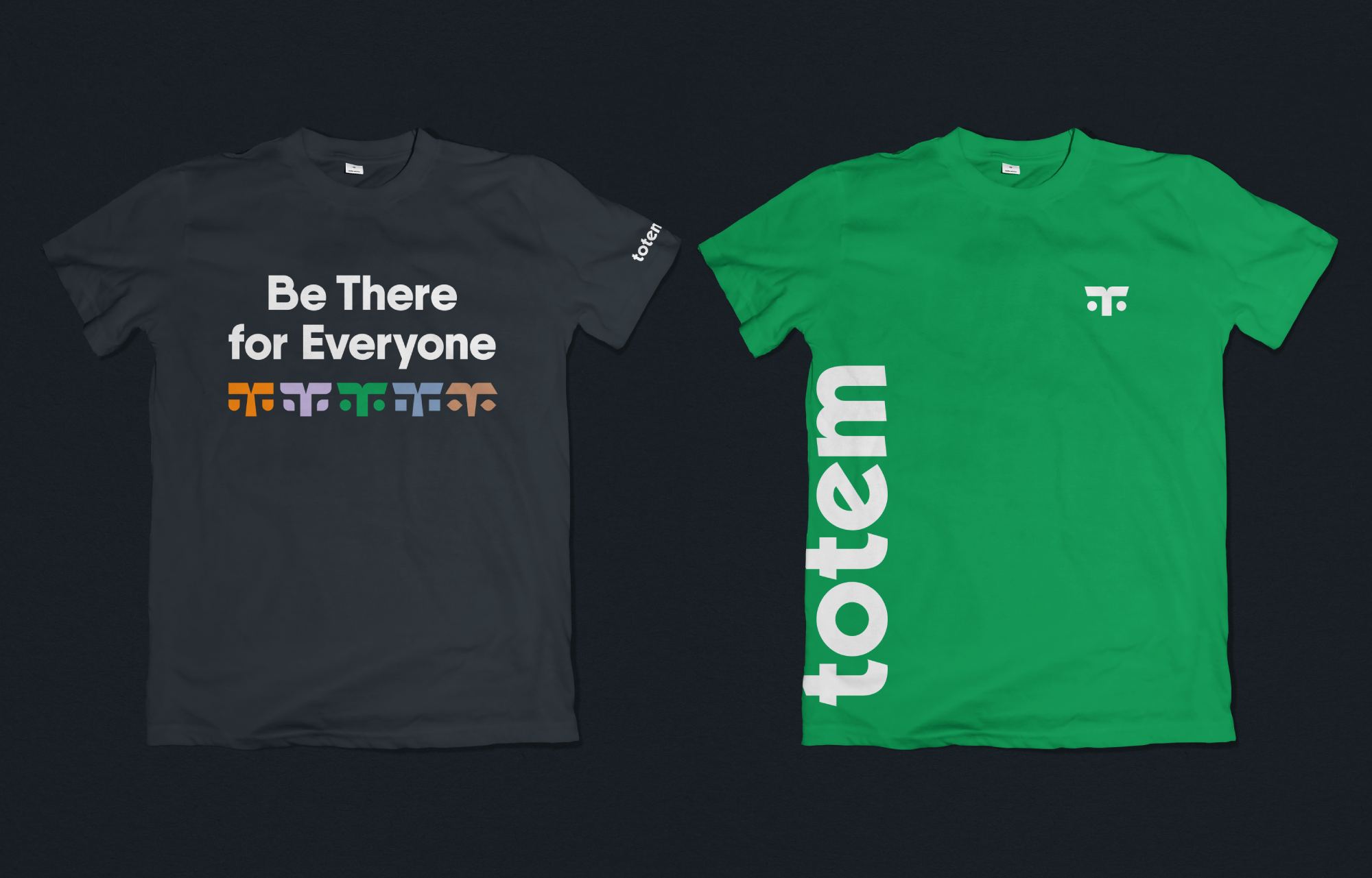
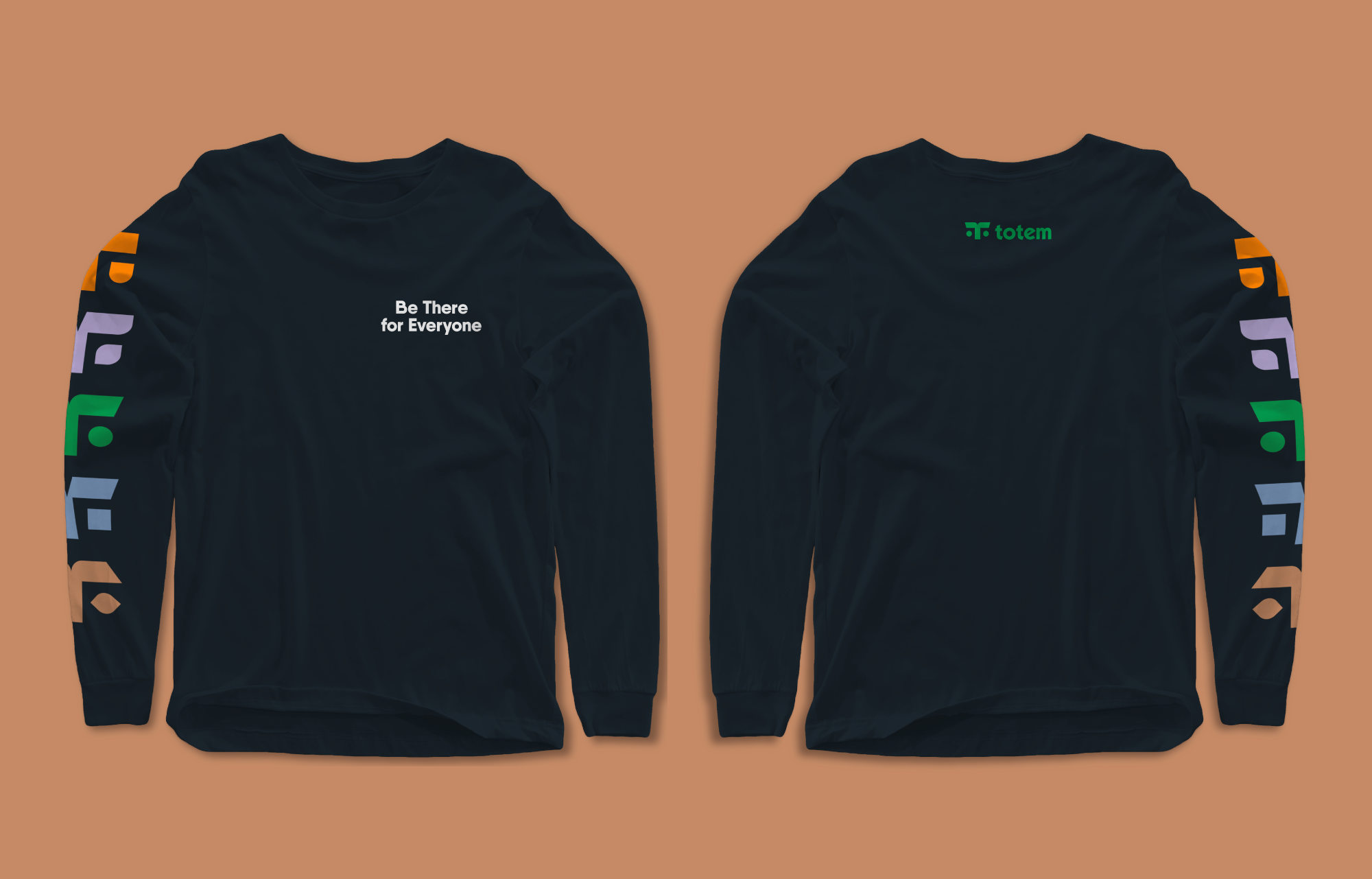
Be There for Everyone
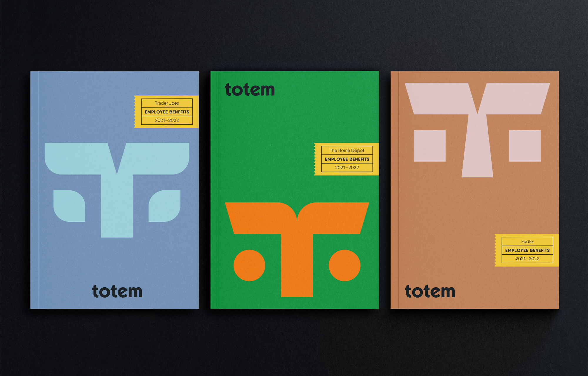
In an industry dominated by benefits management giants offering standard-issue (“benefits-in-a-box”) plans, Totem has set itself apart with a more customized, nimble approach.
They help clients navigate the complexities of a changing field by creating personalized solutions that serve actual needs. Taking ownership, their offerings are rooted in serving their customer’s needs with transparent and responsive human communication.
A complete overhaul of the brand was established to engage the character of their name and the loyal, relationship-driven personality of their vocation.
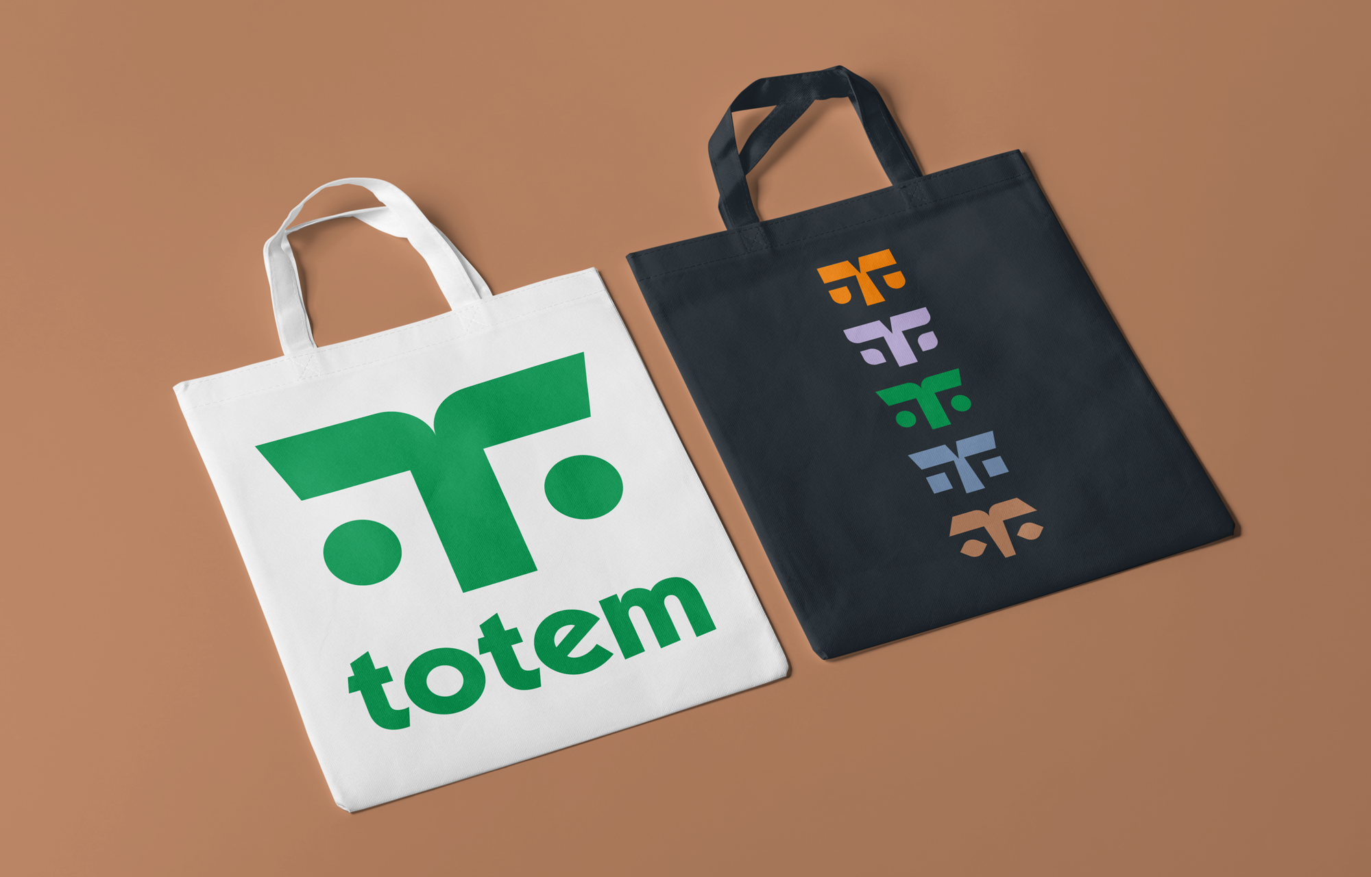
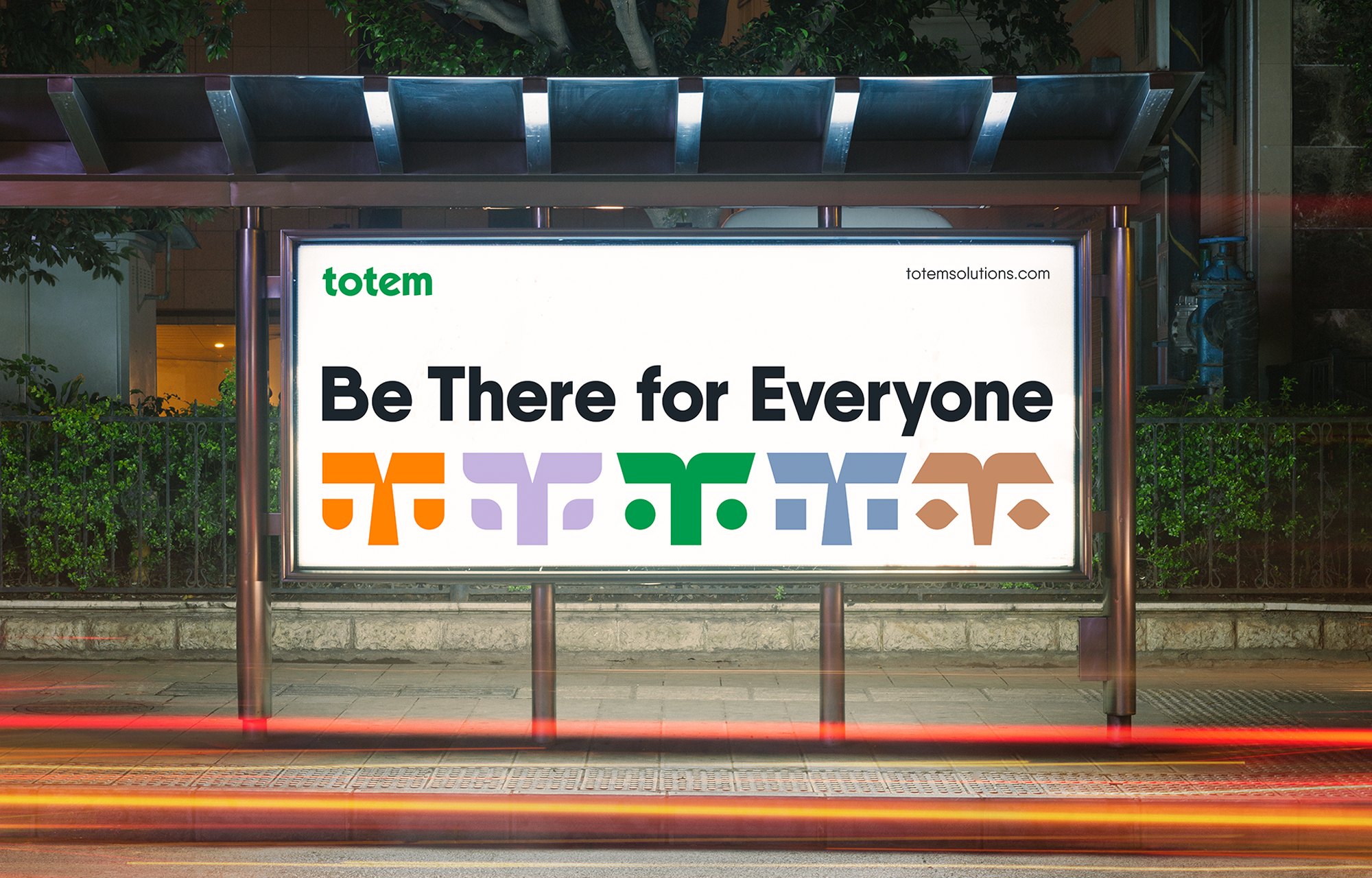

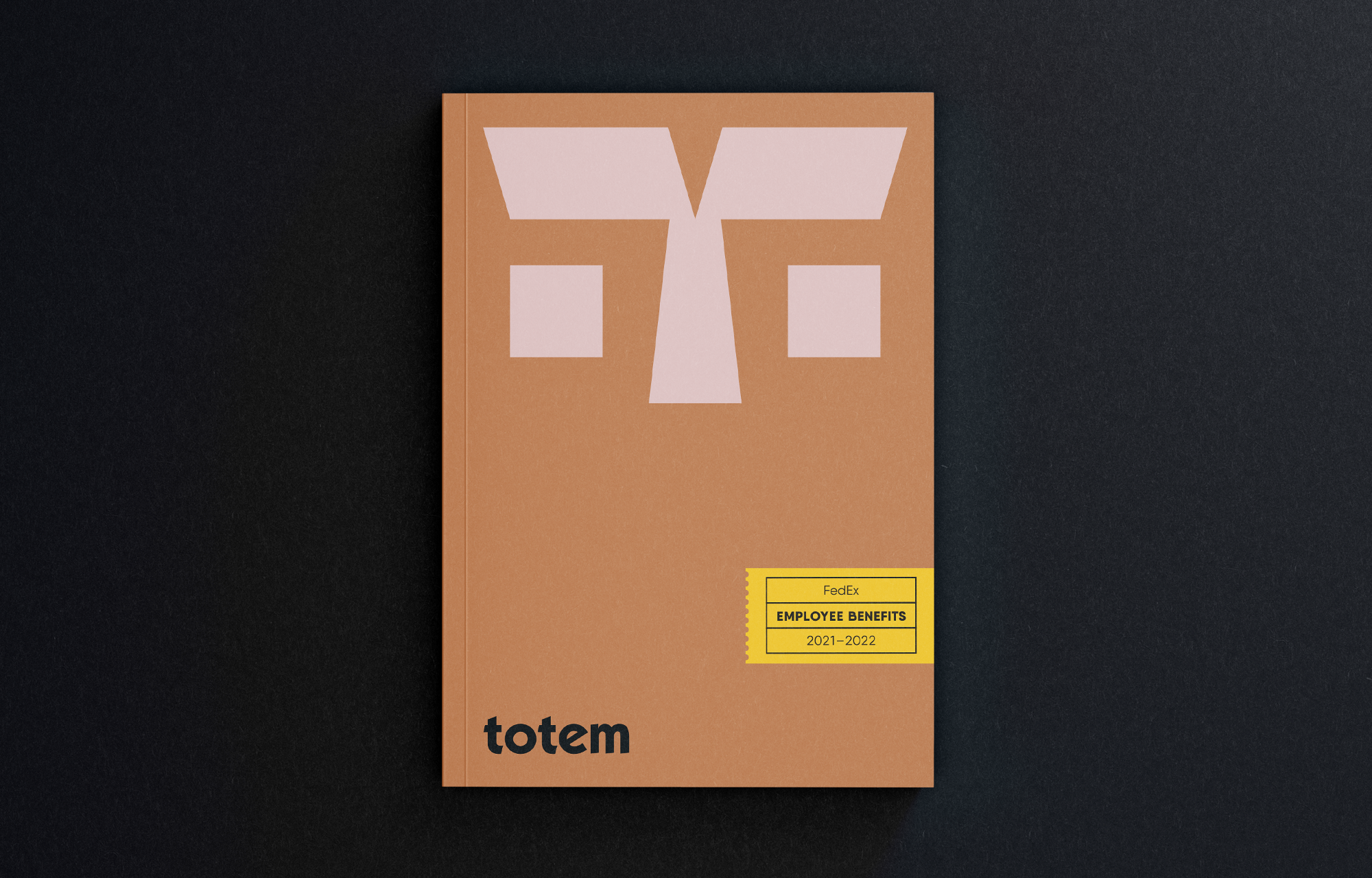
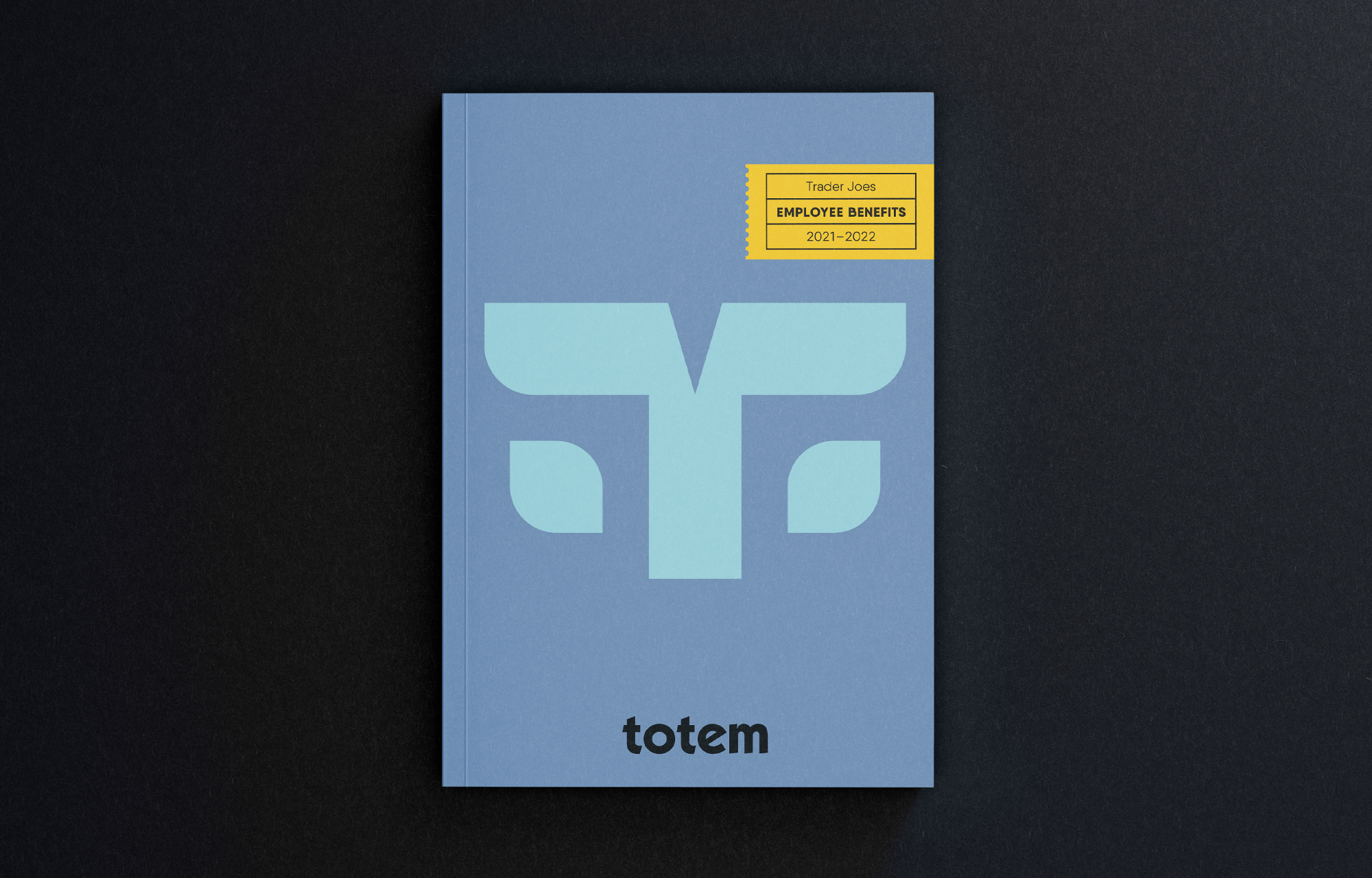
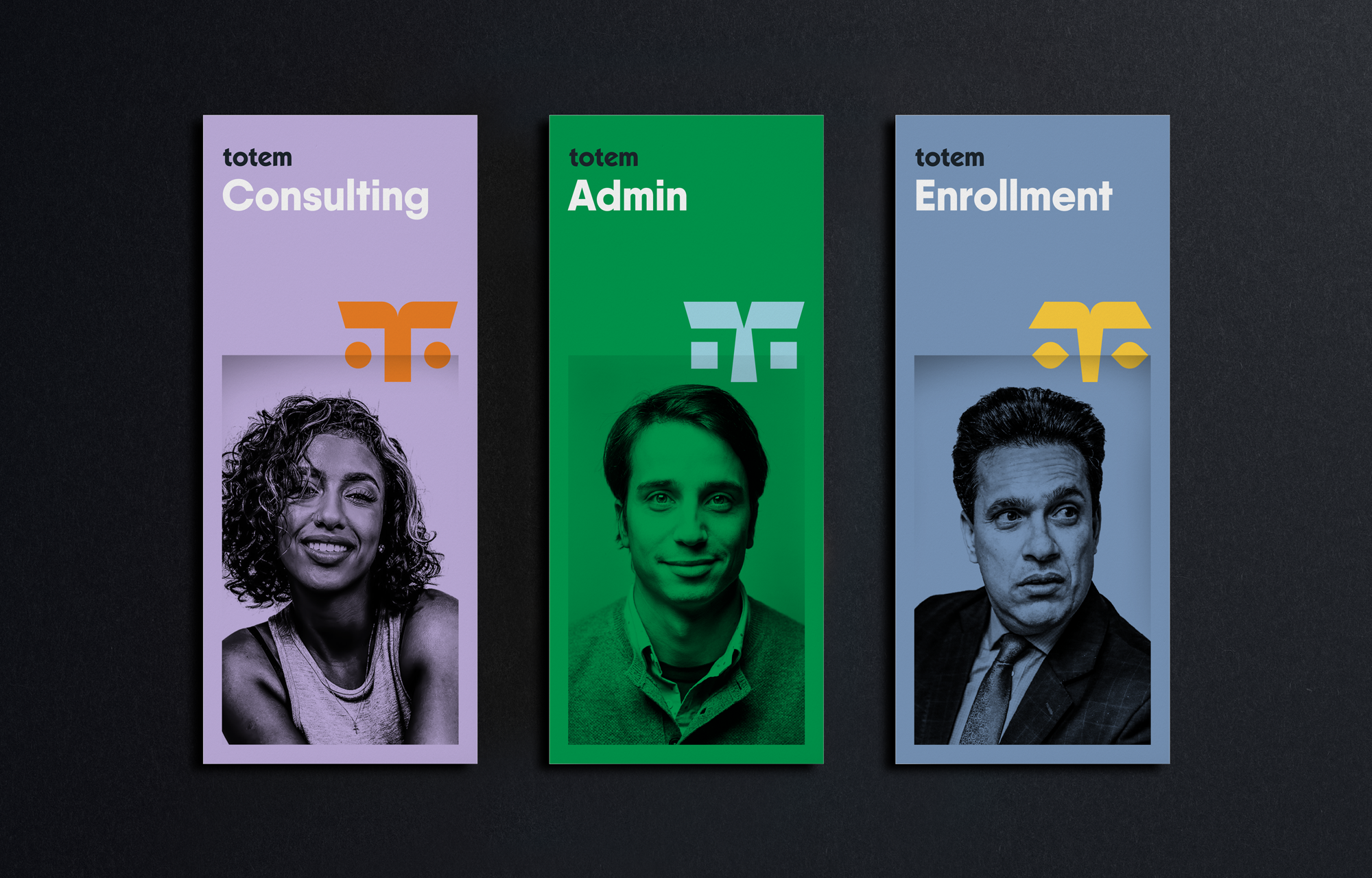
Describing themselves as “flexible” and “possibility-seeking” in a market that often feels stifiling, Totem’s creatively responsive persona comes to life through unique face symbols that stack in a metaphorical totem. These faces populate the brand to create an approachable lure while leaving an enduring impression.


© Brian Paul Nelson, LLC in partnership with Matchsic

© Forever x Infinity, Brian Paul Nelson, LLC
Thanks for being here. ︎
Thanks for being here. ︎