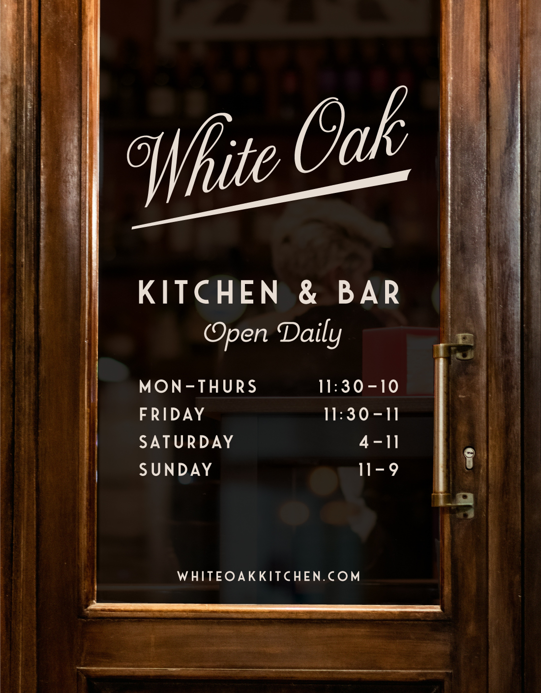
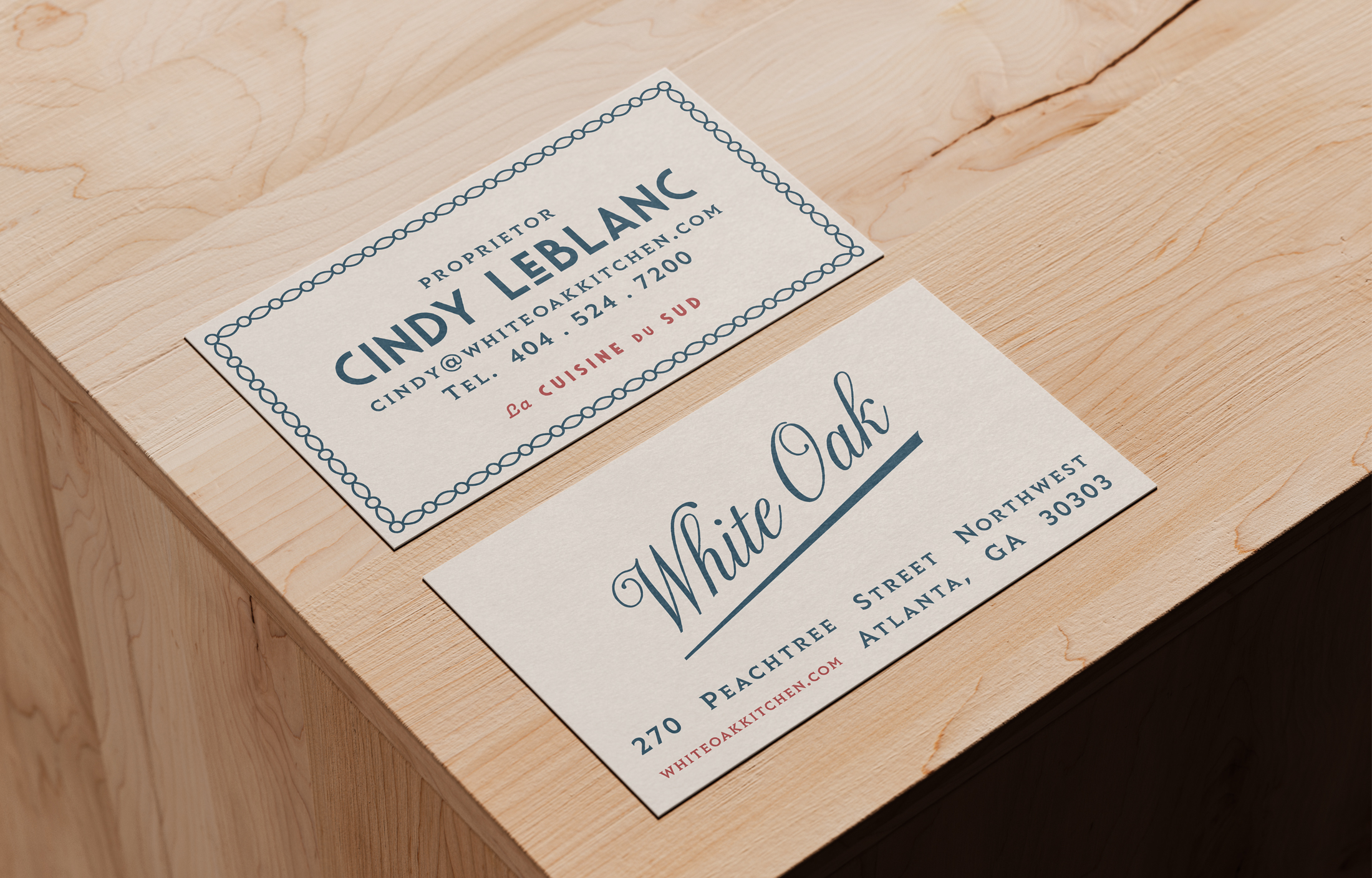
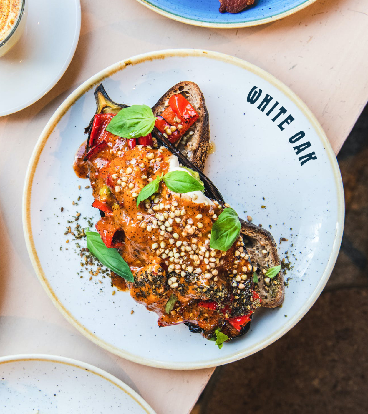
White Oak

La Cuisine du Sud
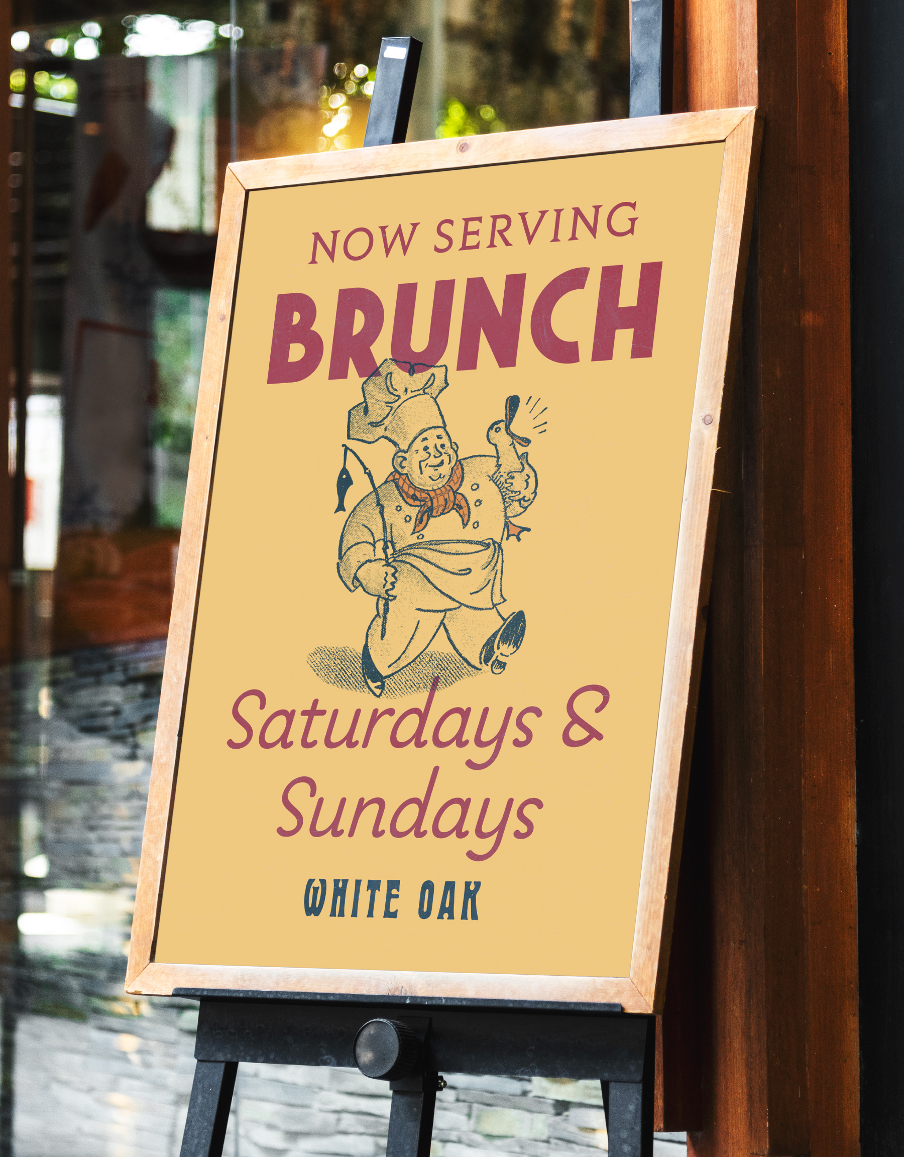
Brand identity redesign for downtown Atlanta’s White Oak restaurant. Blending Southern American with Southern European inspired offerings, White Oak prides themselves on crafting A Cultured Dining Experience unique to the city.


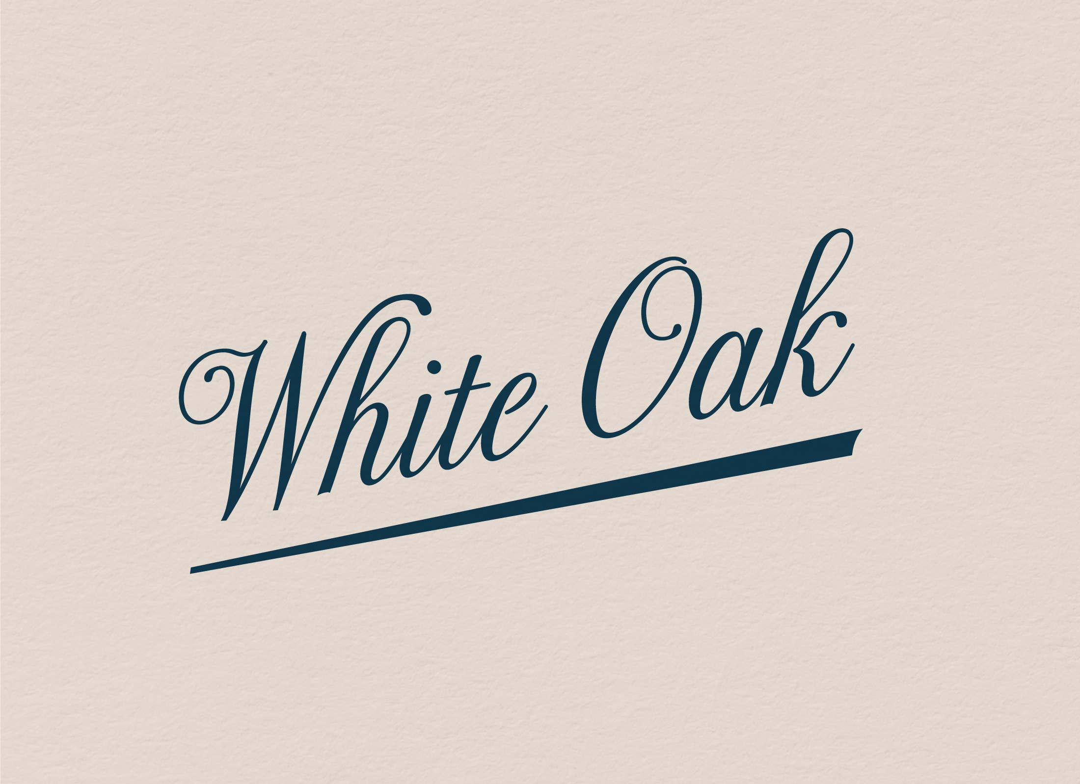
Custom Primary Wordmark

Secondary Wordmark


Before
After
—
© Brian Paul Nelson, LLC

© Forever x Infinity, Brian Paul Nelson, LLC
Thanks for being here. ︎
Thanks for being here. ︎