Department of City Planning
Atlanta at its Finest
Atlanta’s Department of Planning and Community Development has a lot to say to a lot of people, but the messages aren't always clear. With big dreams to build a closely aligned department and drive responsible growth in our city, Commissioner Tim Keane sought much needed help. Working with him and his core team we uncovered why the department exists and what they hope to accomplish.
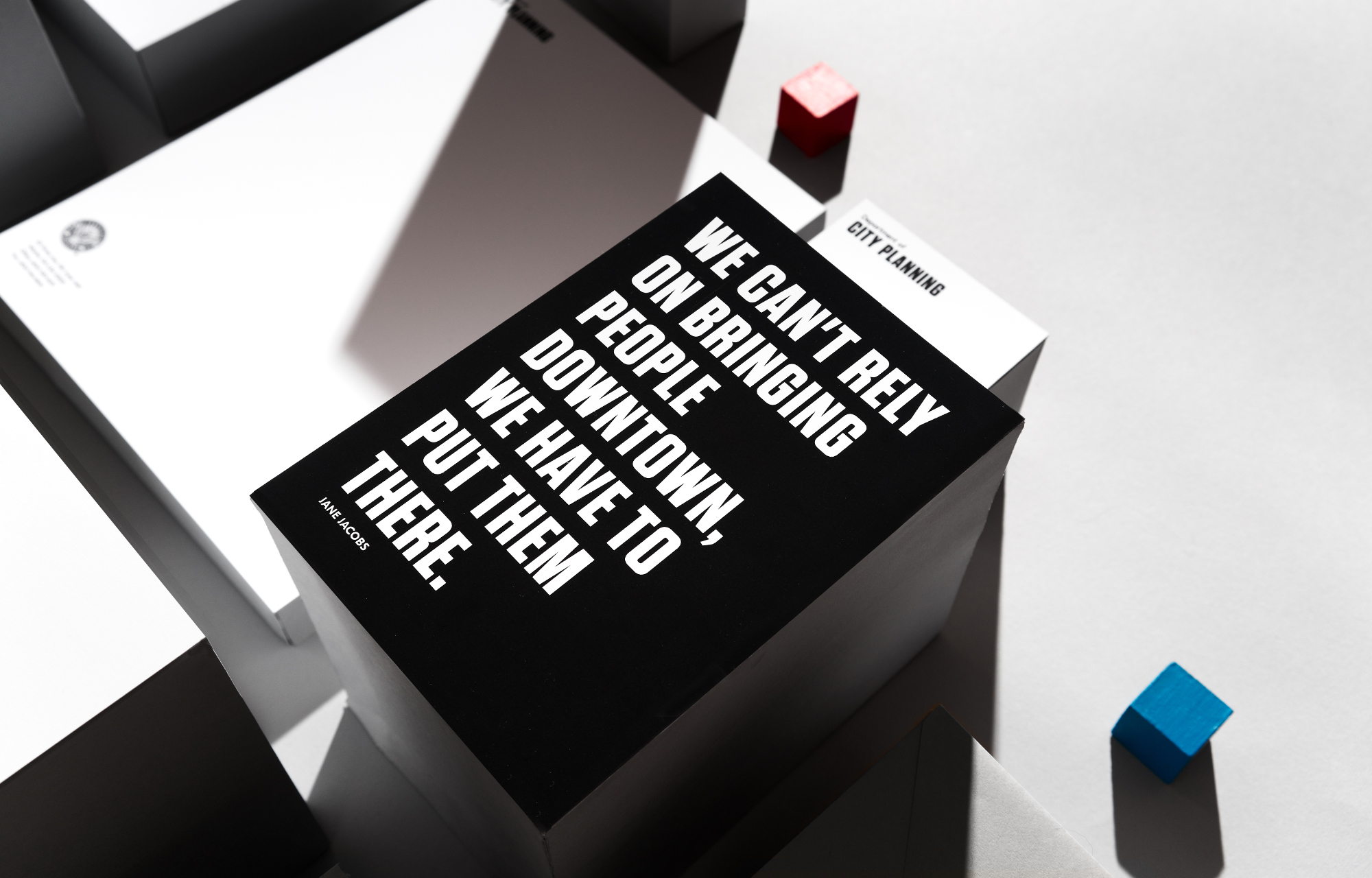
The result was a focus on designing Atlanta at its finest and drive the message that:

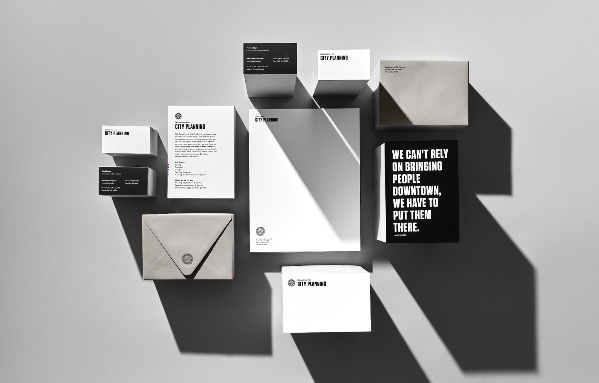
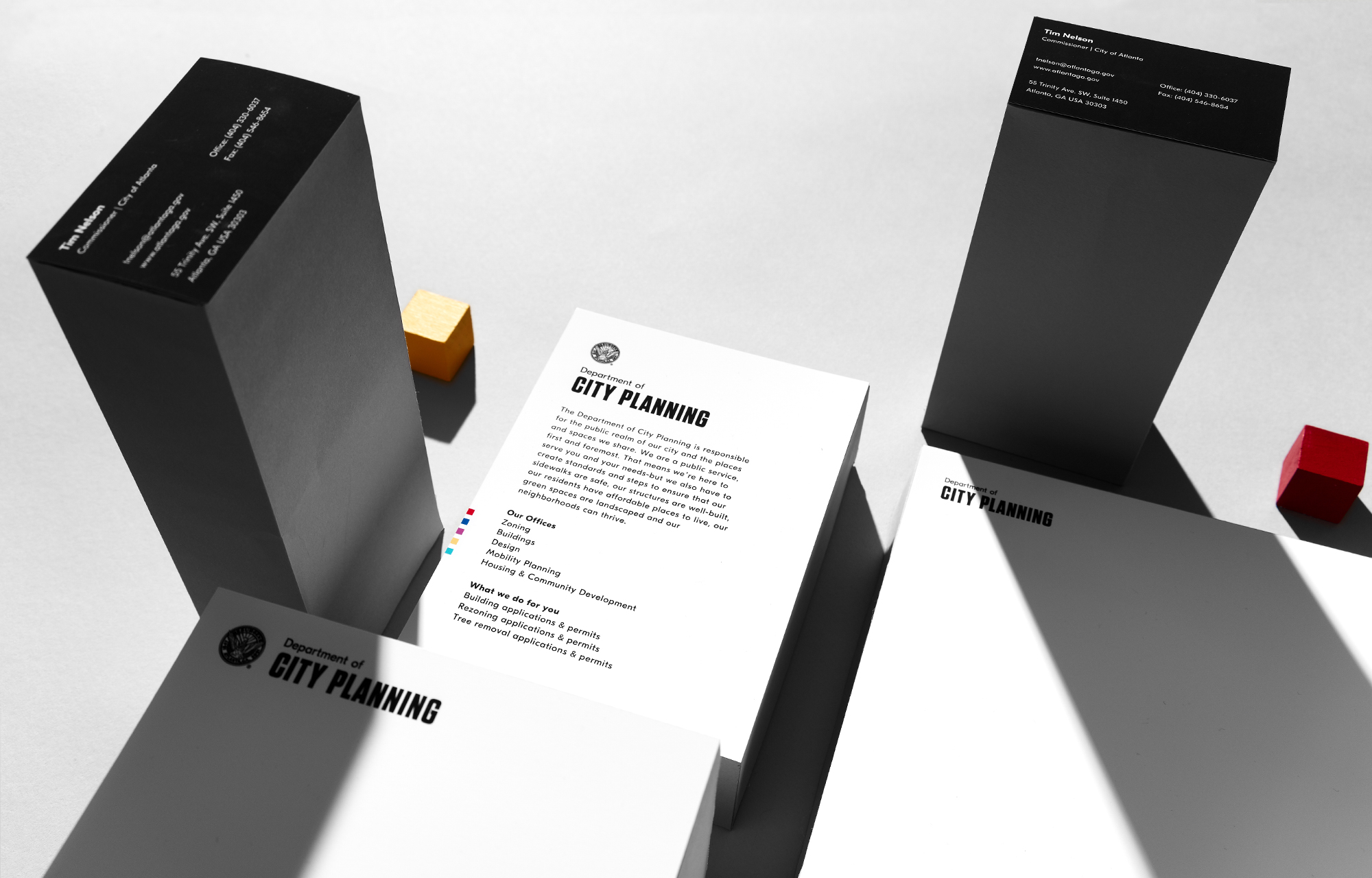
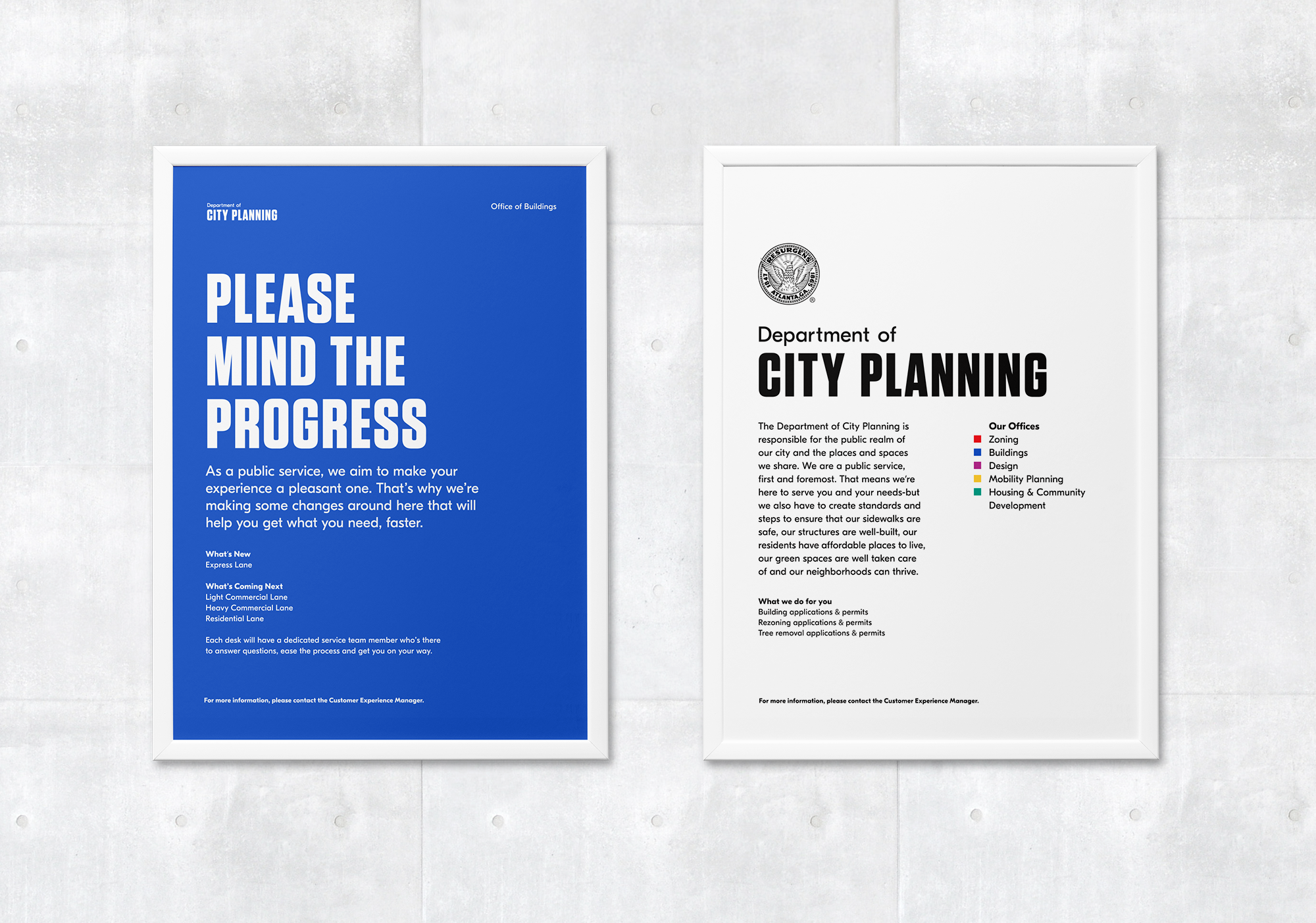
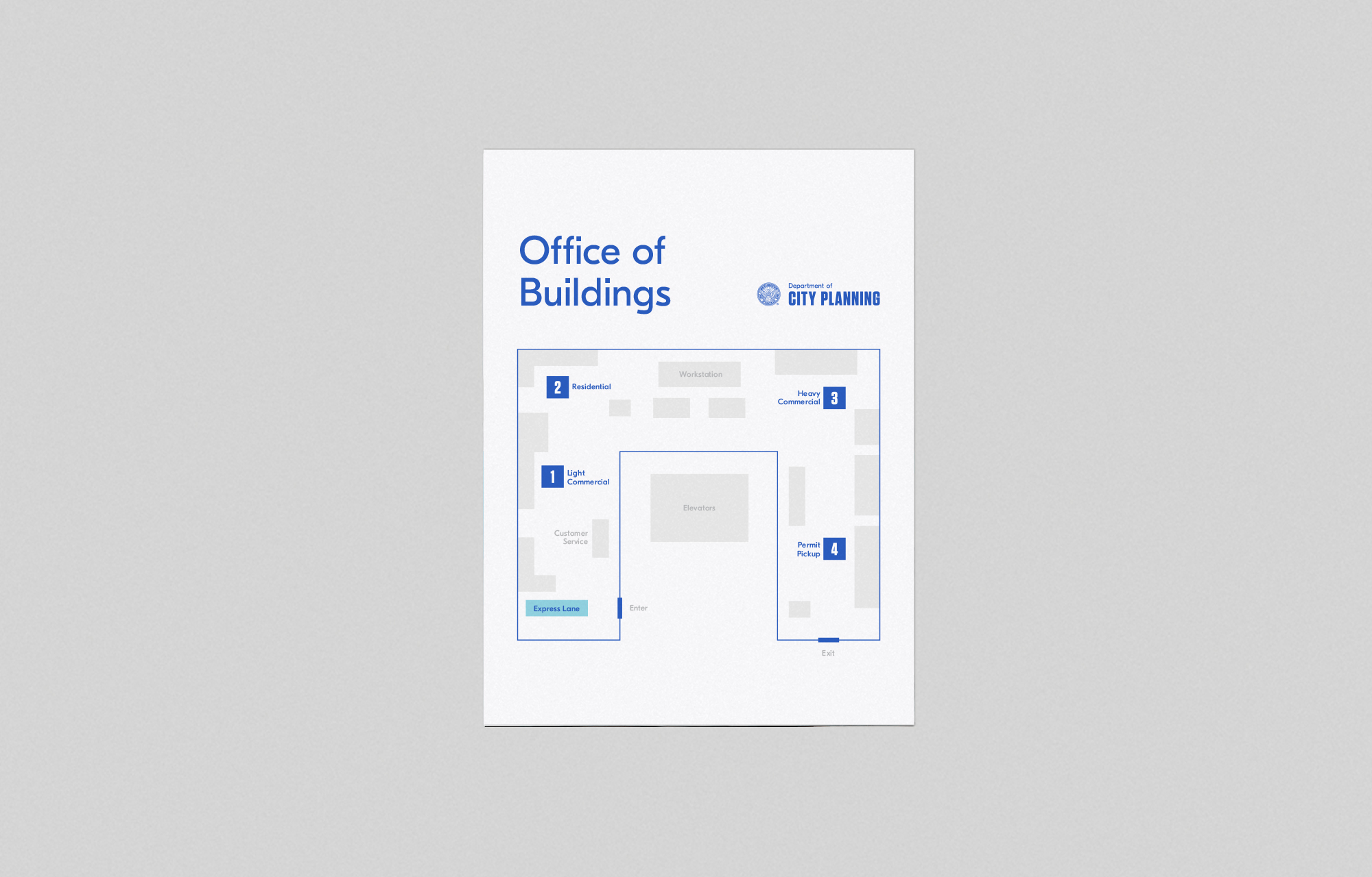
The challenge was to design a system within the long-standing city brand, including a seal that's been around since the 19th century. In response, a clear hierarchy was created using practical typography, focusing more on utility than ornamentation. We were also charged with humanizing the language they use, to better inform the public and provide clear direction.
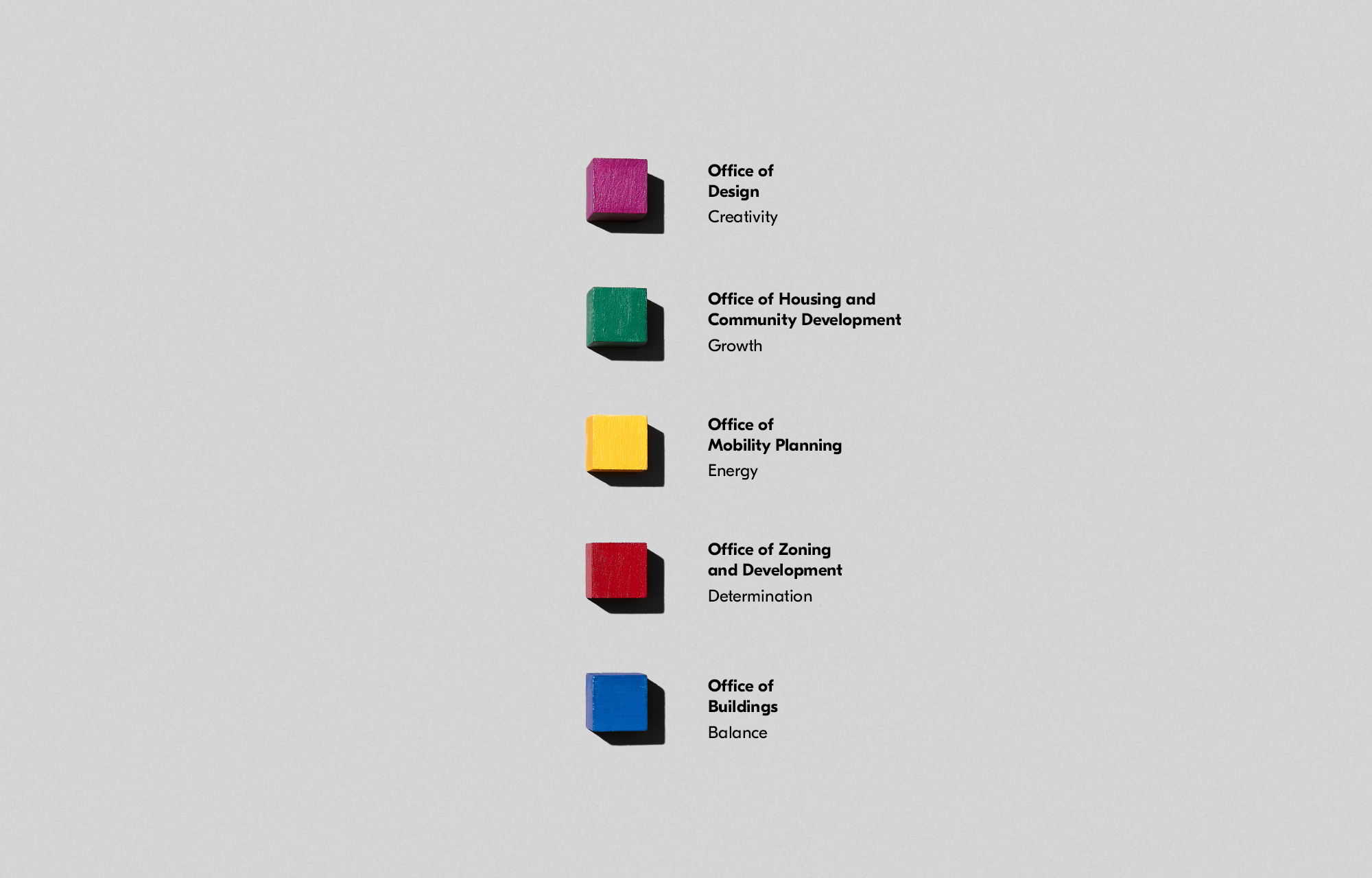
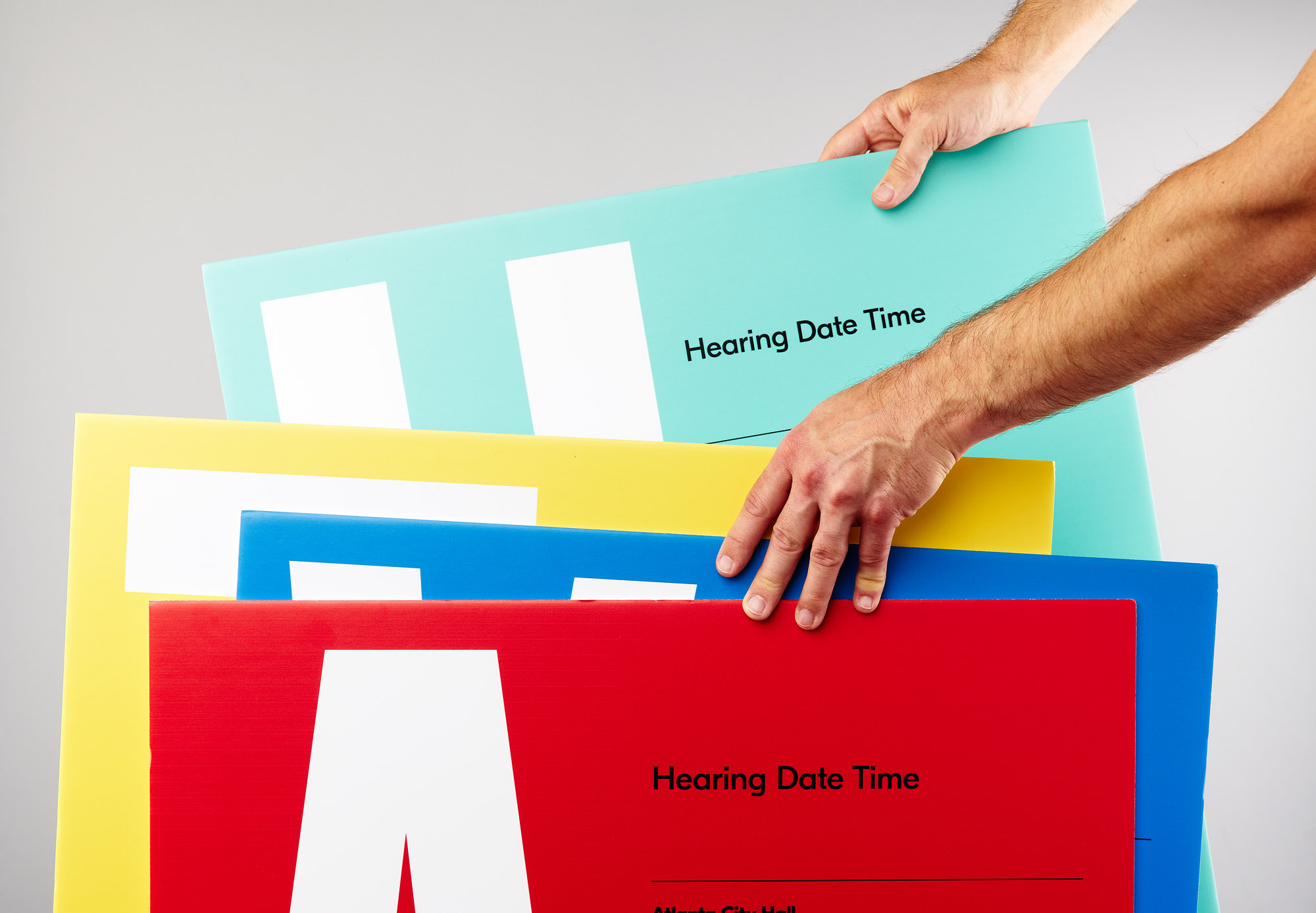
The brand architecture was also updated using emotional color theory to differentiate the offices within the department. These color blocks became assets within the overall visual identity system.
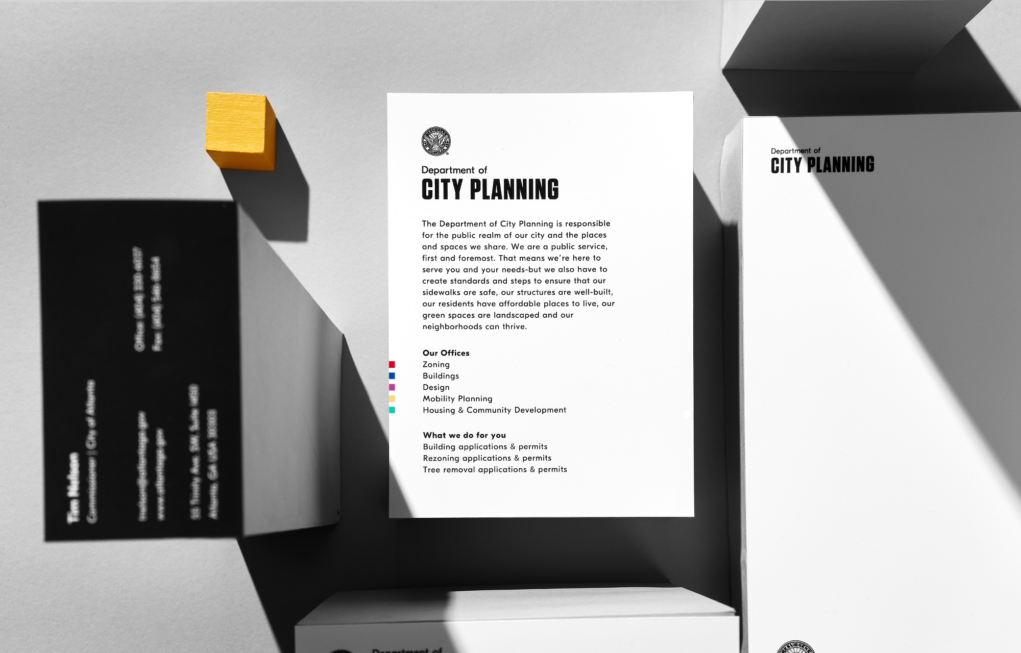
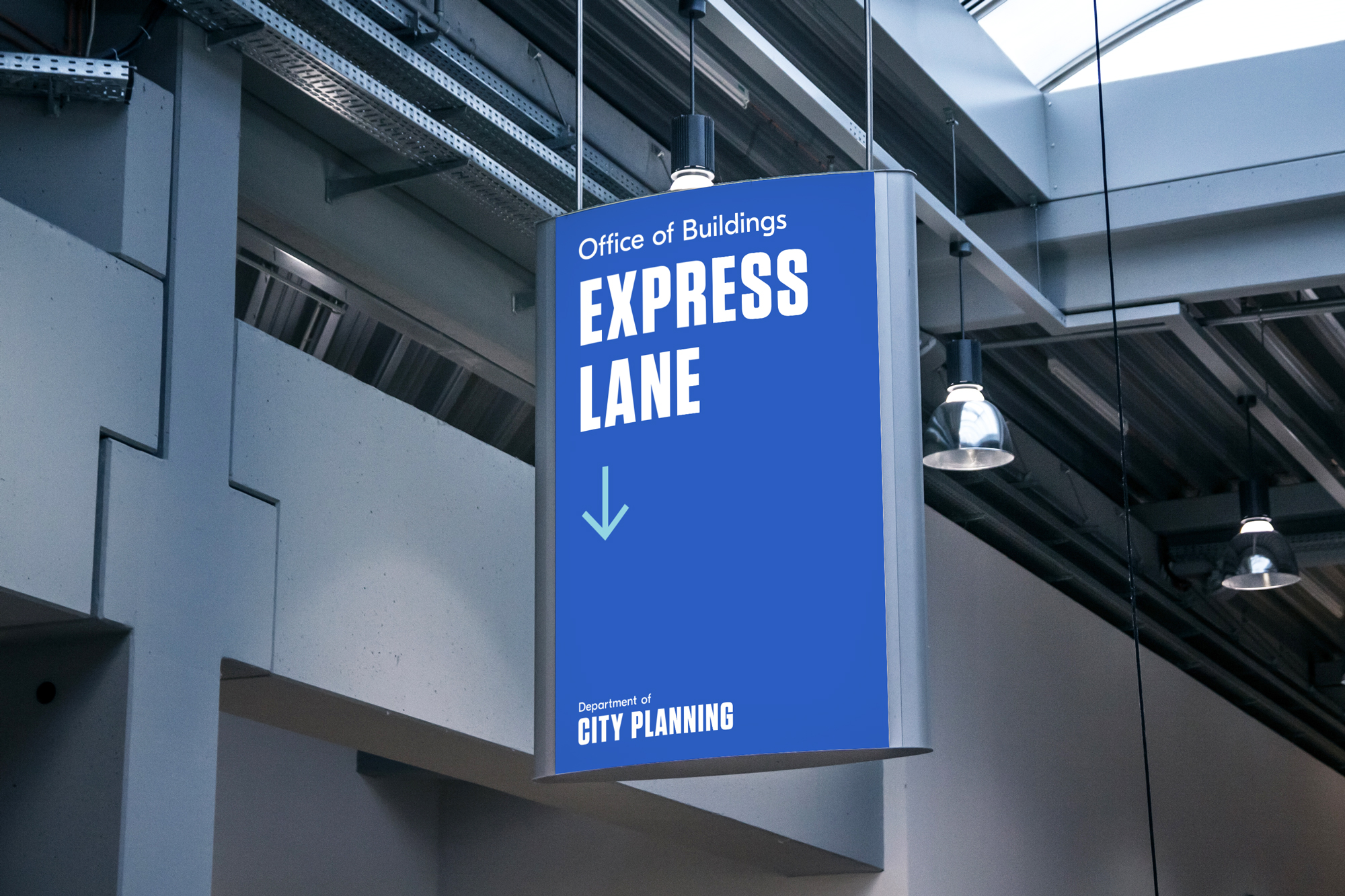
What came next were a series of improvements to the customer experience. A new department name was given and we helped implement new way-finding standards within the offices, including signage that would clearly direct people through the permitting and approval process.
As a public service, Department of City Planning prides itself on showing up every day to give Atlanta its all. Their new identity system helps them do this by removing barriers for citizens to interact with the department.
As a public service, Department of City Planning prides itself on showing up every day to give Atlanta its all. Their new identity system helps them do this by removing barriers for citizens to interact with the department.
After the department rebrand, we were also asked with overhauling the Atlanta Public Notice signs. View Case Study

© Forever x Infinity, Brian Paul Nelson, LLC
Thanks for being here.
Thanks for being here.